

Welcome to The Framed Focus Blog!
Composition in Photography Explained: How to Create Stronger Images
Composition in photography shapes how an image is seen, felt, and understood. This post explains what composition really is, why it matters, and how learning to see the frame with intention can help you create stronger, more compelling images.

52 Clicks | Week 26 | Frame Within a Frame
52 Clicks | Week 26 | Frame Within a Frame
For the month of July, we will be exploring different perspectives in our Project 52. The first one was to focus on adding an additional frame within the image. The frame could be super obvious (think: door frames, mirrors, windows, etc). Or it could be something more implied (think: layering with foreground/background items). Or the framing could be something creative (think: light painting, double exposure, etc). Whatever the chosen frame, the p52 participants showed off last week with their images.
If you're wanting a challenge like this, there's still time to hop in the project with us.
xoxo,
Angie Mahlke

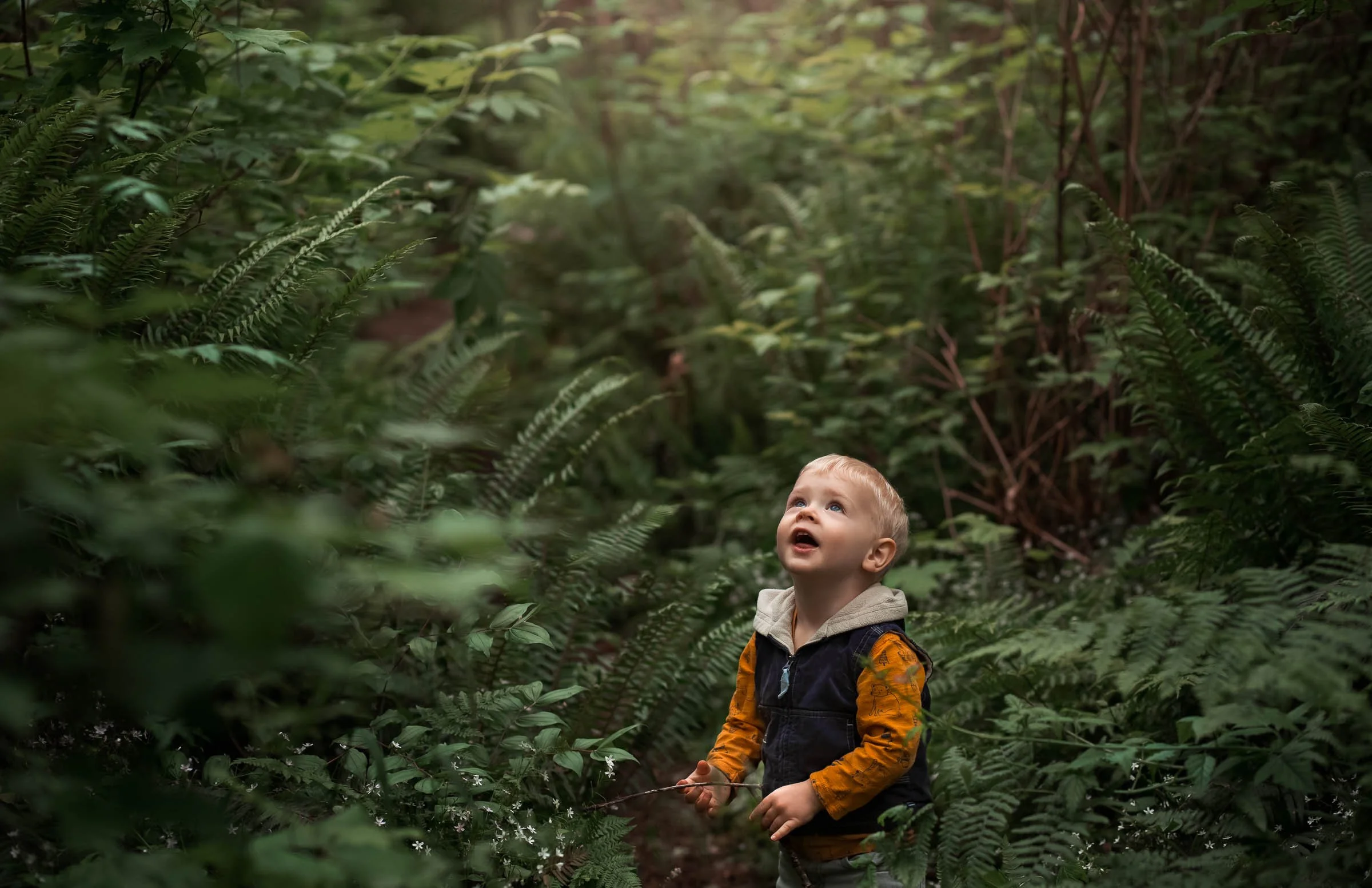
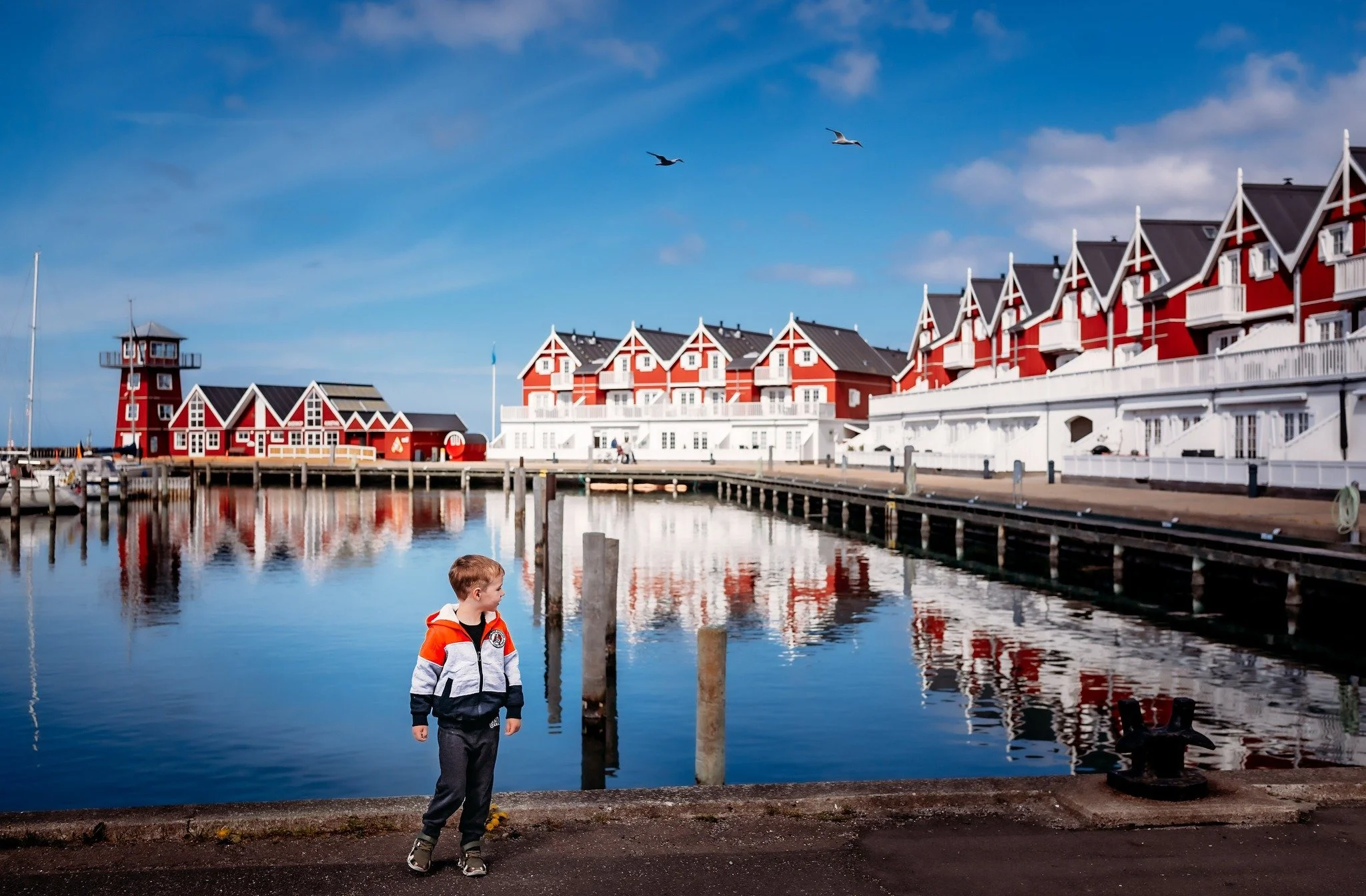
Why Nature Photography Changed the Way I See the World | by Holly Awwad
Nature photography has a way of changing how you see the world. What starts as a search for beautiful landscapes often becomes a deeper appreciation for the small details most people overlook. In this post, I share how photographing nature has taught me to slow down, notice the beauty in ordinary places, and approach editing with the goal of enhancing a moment rather than transforming it. If you love natural-looking edits and realistic colors, you'll find plenty of inspiration here.

52 Clicks | Week 25 | Favorite Place
52 Clicks | Week 25 | Favorite Place
If you had to choose a favorite place, where would it be? That was the final theme for our favorites month in our Project 52. The p52 participants chose either a favorite place they like to take pictures or a place that is special to them.
It's been a fun month exploring our favorite things, and I'm going to be a little sad to move on. But we have lots of weeks left in the project with plenty of other fun things to dig into. If this appeals to you, join us!
xoxo,
Angie Mahlke
5 Exercises to Elevate Your Mobile Photography Skills | by Kristen Ryan
Want to take better photos with your phone? The key isn't having the newest smartphone—it's understanding what your camera can do. In this article, you'll learn five practical mobile photography exercises that will help you improve your exposure, focus, composition, portraits, and editing skills. Whether you're using the latest iPhone or an older model, these simple exercises will help you gain confidence and create stronger images with the camera you always have with you.

52 Clicks | Week 24 | Favorite Time of Day
52 Clicks | Week 24 | Favorite Time of Day
Do you have a favorite time of day? Either to grab your camera and snap away or to simply enjoy life's little pleasures. That was last week's prompt in our Project 52. The p52 participants documented a time of day they gravitate toward when taking pictures or some part of their day they find extra special.
So what time of day would you choose for this theme? You could always hop into the project and do just that!
xoxo,
Angie Mahlke
Back‑Button Focus: the magical trick that makes fast‑moving photography SO much easier! | by Elodie Meyer
If you've ever struggled to keep a fast-moving subject in focus, back-button focus might be the game-changing technique you've been looking for. Instead of using the shutter button for both focusing and taking the photo, back-button focus separates those tasks, giving you greater control over your camera's autofocus system. Whether you're photographing wildlife, birds in flight, sports, or active children, this simple camera setting can help you track movement more effectively, react faster, and capture more keepers.

52 Clicks | Week 23 | Favorite Viewpoint
52 Weeks | Week 23 | Favorite Viewpoint
Most of this photography project is spent going out of our comfort zone and learning new things. New techniques are introduced. We're encouraged to try different compositions. The point is to discover the great big wide world of photography. So now that we're hitting the pause button with our favorites theme, it's been fun focusing on the things that bring us joy. It's been a great reminder that we don't always need to strive for the next goal. Sometimes we can just do what makes us happy.
Last week we explored our favorite viewpoint, and I think you'll agree with me that the p52 participants really understood the assignment! If this appeals to you at all, we'd love to have you in our Project 52.
xoxo,
Angie Mahlke

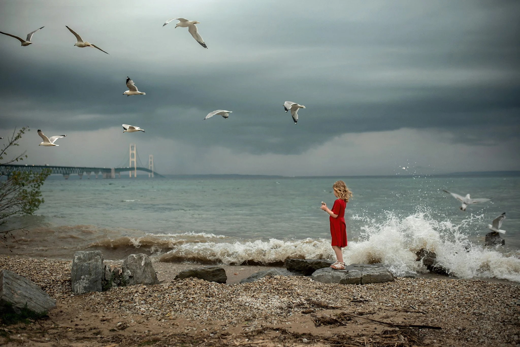
Chase the Rainbow Project | Rainbow
In photography, colour does far more than add visual interest. It shapes the mood of an image, draws the viewer in, and helps communicate the story. In our Chase the Rainbow project, we celebrate colour by focusing on a different shade each month. Whether that’s seeking out the colour in nature, spotting it at home, or styling a scene with thoughtfully selected props and clothing, the project encourages creativity and seeing the world through a more colourful lens.
“All the best things in life are free: love, smiles, friends, family, pets & companions, thoughts, sunsets & sunrises and especially rainbows.” - Anthony T. Hincks
June’s colour is rainbow!
Not just one colour, but every colour together. A rainbow appears when light is refracted through raindrops, creating a beautiful spectacle across the sky. Often seen as a symbol of hope, renewal, and brighter days after a storm, the rainbow reminds us that beauty can emerge from challenging times. It is also widely recognised as a symbol of Pride, celebrating diversity, inclusion, and the vibrant spectrum of people who make up our communities.
Enjoy looking through all our rainbow images.

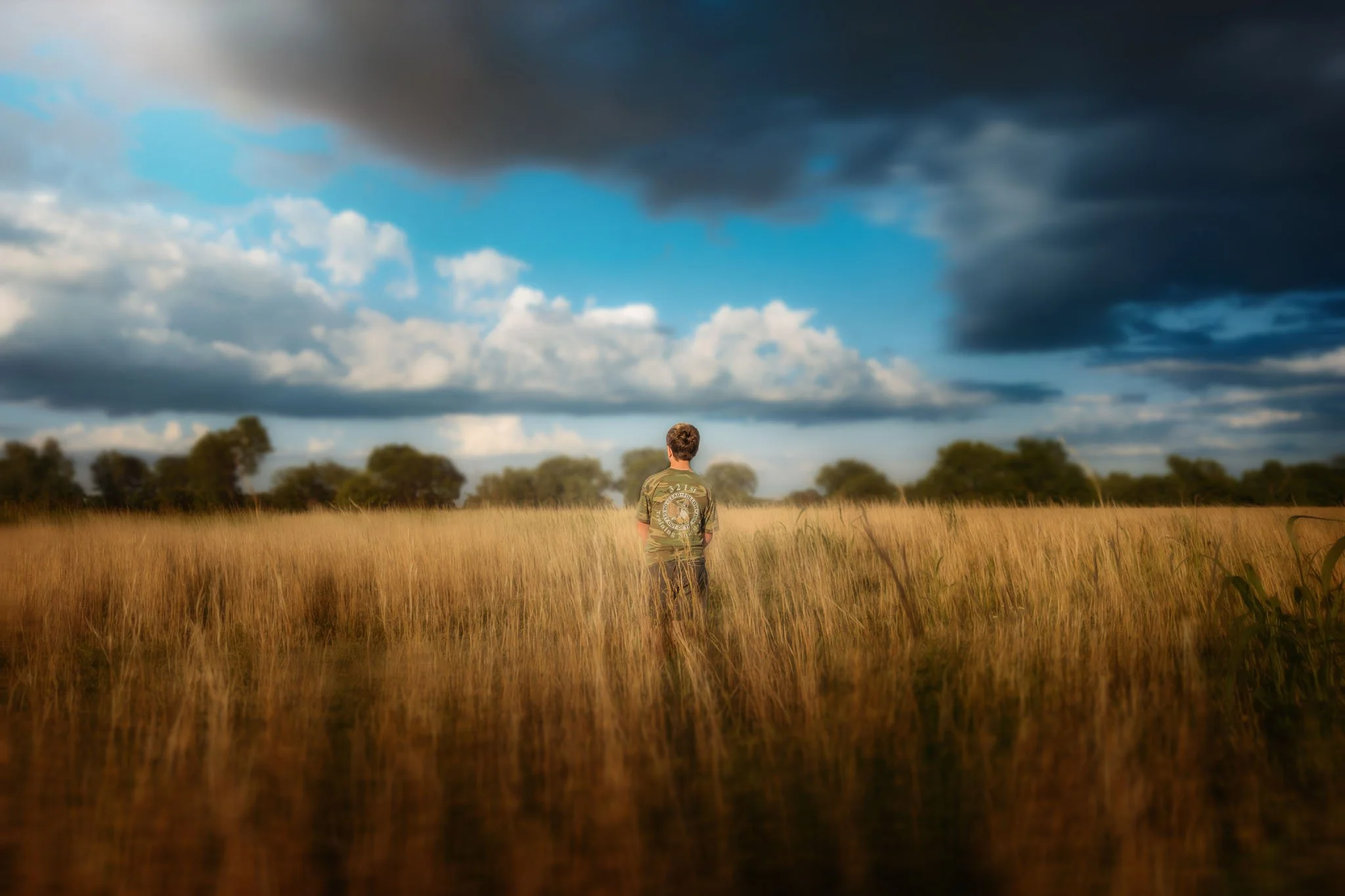
52 Clicks | Week 22 | Favorite Subject
52 Clicks | Week 22 | Favorite Subject
Sometimes the easiest way to find your way out of a creative rut, or to rediscover your original joy in photography, is to focus on all your favorite things. The month of June in our Project 52 is all about our favorites. We started with our favorite subject.
As it always seems to happen with open-ended themes, we may have spent a fair amount of time overthinking things. Once we got past the idea that we didn't have to pledge our undying love and devotion to one single subject as our most favorite, then things got rolling.
Scroll down to see what the p52 participants chose as {one of} their favorite subjects. It's an interesting mix of people, pets, wildlife and nature.
What would you choose as your favorite subject to photograph? If a month of favorites sparks your creative flame, you can still hop in our project!
xoxo,
Angie Mahlke
Film Photography: Why So Many Photographers Are Falling Back in Love with Film
Film photography is about more than nostalgia. Discover why so many photographers are falling back in love with film and how you can confidently start shooting film yourself.
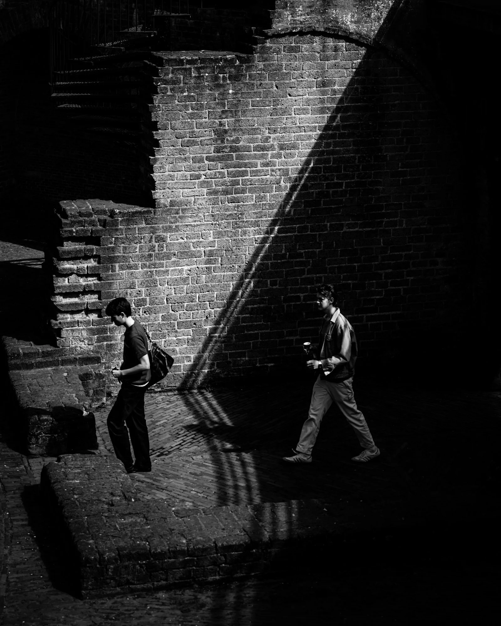
52 Clicks | Week 21 | Chiaroscuro
52 Clicks | Week 21 | Chiaroscuro
The fun thing about any photography project is learning new things and challenging ourselves. That's how we learn, right? And isn't that the goal? Last week in our Project 52 we introduced a term that is brand new to most of us: chiaroscuro. It's a word that is even hard to pronounce (a Google search gave me differing pronunciation so it still remains a mystery to me), so it seems big and scary. But the interesting part is that once people discovered what it meant, they realized they've already been doing this technique all along. They just never had a name for it.
So what does this intimidating term mean? Literally it translates to bright-dark. And to break it down in simple terms, it's just an artistic technique that emphasizes the high contrast between lights and darks with the goal of creating a three-dimensional image. Google it to learn the art history behind it if you'd like!
In the meantime, scroll to see how the p52 participants used the technique. I bet after seeing these examples you'll realize it's something you've been doing all along, too.
If you'd like a weekly challenge like this, it's not too late to hop in the group!
xoxo,
Angie Mahlke

The Skin Tone Editing Mistake Most Photographers Don’t Realize They’re Making | by Laura Froese
Struggling to figure out why your skin tones look slightly “off” even after hours of editing? In this post, I’m breaking down some of the biggest mistakes photographers make when editing skin tones in Lightroom, including colour casts, inconsistent white balance, and workflow issues that can make editing feel frustrating and random. I’m also sharing how understanding RGB values can help you create more natural, believable skin tones with greater consistency and confidence.

52 Clicks | Week 20 | Silhouette
52 Clicks | Week 20 | Silhouette
Silhouettes rate up there as one of my favorite photography techniques. They're a fun way to get creative, but they can be challenging. The trick is to make sure your subjects don't turn into indistinguishable black blobs. Scroll down to see how the Project 52 participants tackled this theme.
xoxo,
Angie Mahlke

Chase the Rainbow Project | Navy Blue
In photography, colour does far more than add visual interest. It shapes the mood of an image, draws the viewer in, and helps communicate the story. In our Chase the Rainbow project, we celebrate colour by focusing on a different shade each month. Whether that’s seeking out the colour in nature, spotting it at home, or styling a scene with thoughtfully selected props and clothing, the project encourages creativity and seeing the world through a more colourful lens.
“Deep blue is the color of my dreams.” - Debasish Mridha
May’s colour is navy!
Navy is an deep, inky blue. It symbolises authority, confidence, stability and trust, and so is often used for corporate branding, uniforms and formal wear. Navy also evokes a sense of quiet strength, bringing to mind the depth of the ocean and the vastness of the night sky. Rarely found in nature, navy carries an added air of mystery and sophistication.
Enjoy looking through all our navy images.

52 Clicks | Week 19 | Shadow Play
52 Clicks | Week 19 | Shadow Play
Using shadows in your images is an easy way to add drama, interest and contrast. It's what was up next in our month of playing with light in our Project 52. Whether you use the shadows as a subject in your image or a compositional tool, there are so many possibilities. Leading lines, pockets of light, textures, storytelling cues and various other creative techniques are at your fingertips with shadow play. The p52 participants used them so brilliantly. Go take a look and then decide how you'd like to use them in your work.
If you're wanting to have some fun with light, you should join us! There's still time to hop in the project. Sign up now!
xoxo,
Angie Mahlke
Taming Greens in your Photos | by Laura Froese
Struggling with greens that look too neon, too yellow, or just off? You’re not alone. Greens are one of the hardest colors to edit because they’re constantly shifting based on light and their connection to yellow tones. In this post, you’ll learn why your greens behave the way they do and how to start making simple, intentional adjustments that actually work—so your edits feel natural, consistent, and fully in your control.
52 Clicks | Week 18 | Reflections
52 Clicks | Week 18 | Reflections
We studied light earlier in our Project 52, and now we're having fun with it! For the month of May, we will explore different ways to use light creatively. We started with reflections, which is one of my favorite ways to add interest, drama, and storytelling. The p52 participants proved to yet again be creative geniuses with this theme. The various reflective surfaces they used, the compelling compositions, and the beautiful storytelling blew me away!
If you're wanting to have some fun with light, you should join us! There's still time to hop in the project. Sign up now!
xoxo,
Angie Mahlke

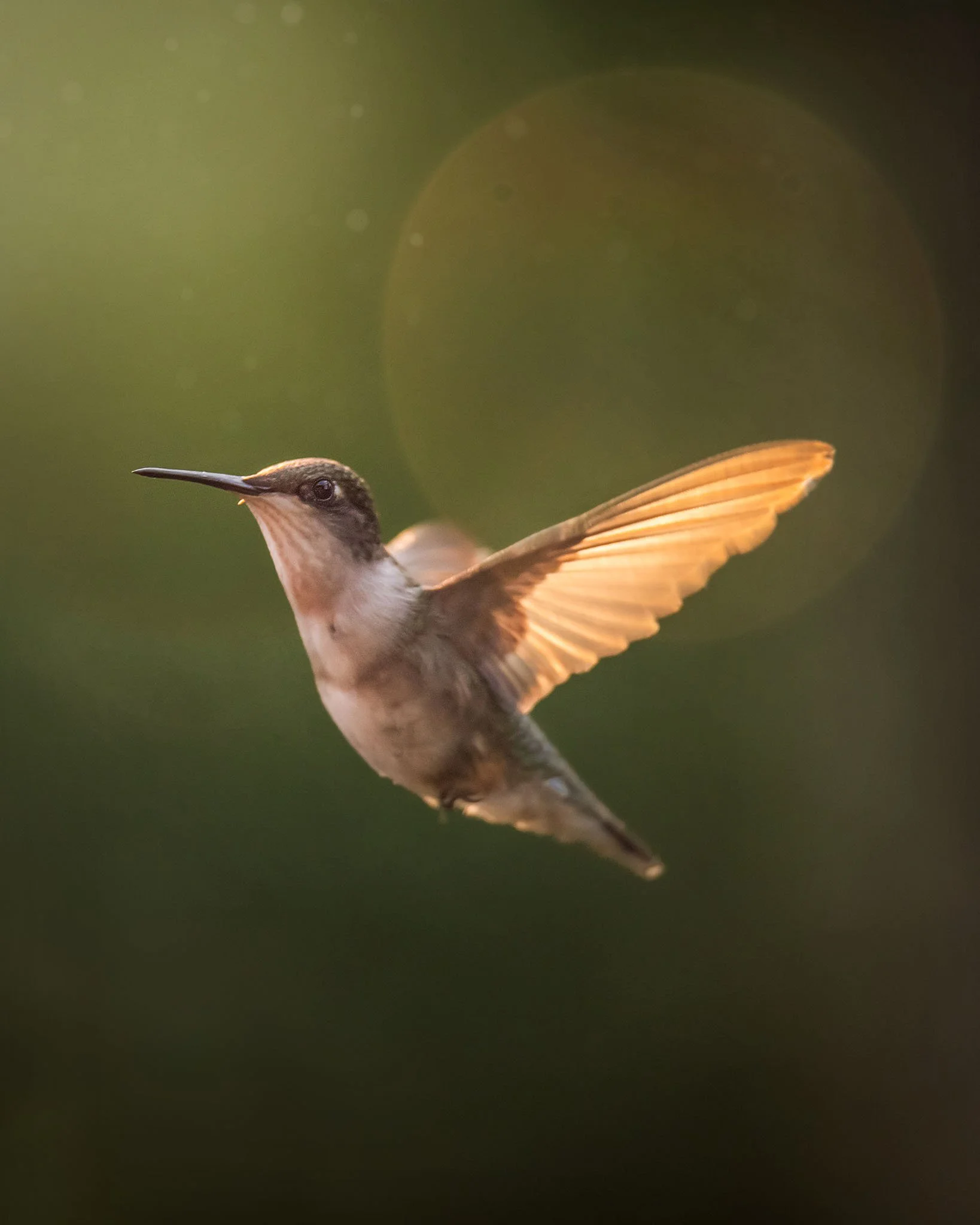
Field guide: 10 creative hummingbird shots you can try this weekend | by Élodie Meyer
Photographing hummingbirds can feel impossible one second and magical the next. Their speed, unpredictability, and tiny movements challenge even experienced photographers—but that’s exactly what makes them so rewarding.
In this creative field guide, you’ll discover 10 unique hummingbird photography ideas you can try right away. From dreamy wing blur to glowing backlit halos and storytelling interaction shots, each concept is designed to help you capture not just sharp images—but emotion, light, and behavior.
Whether you're shooting in your backyard, garden, or local park, these tips will help you slow down, observe more intentionally, and create hummingbird photos that truly stand out.
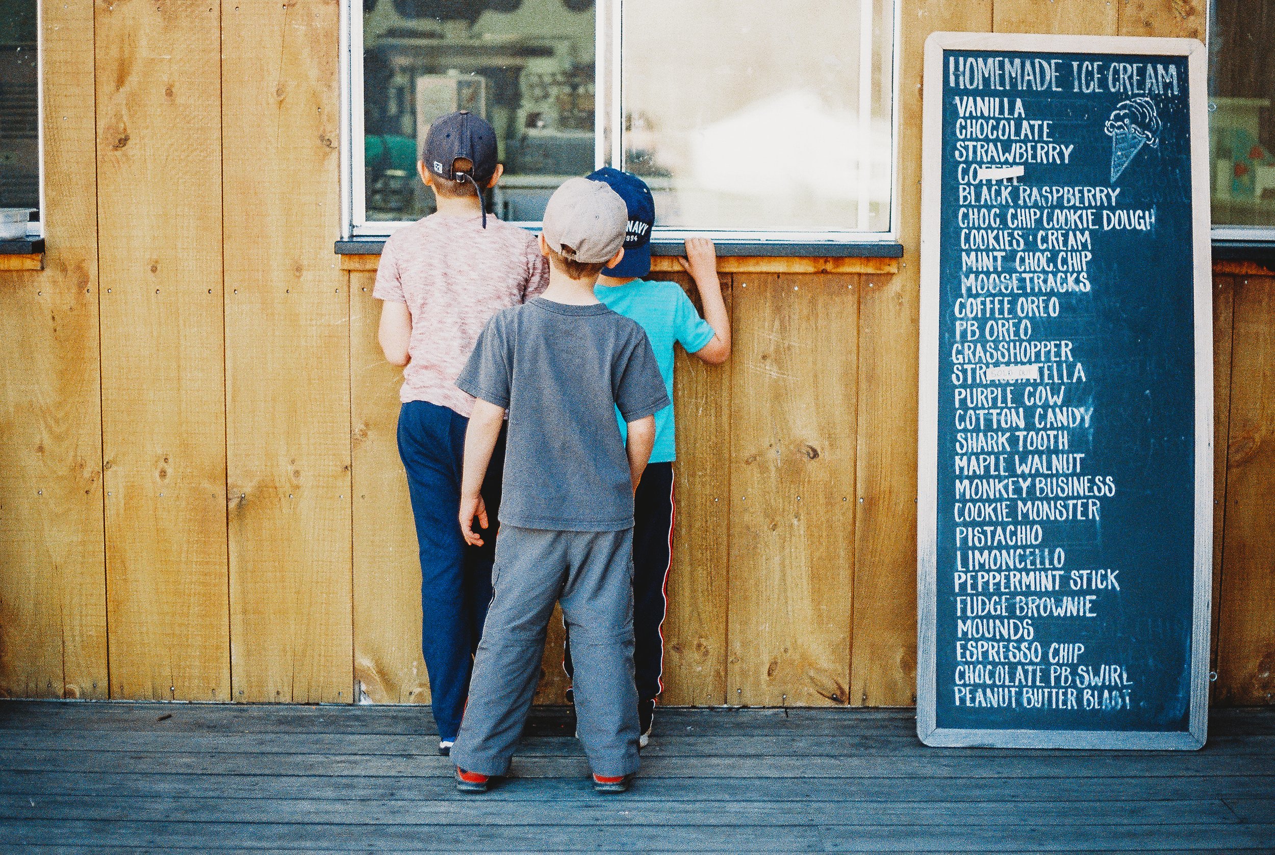
52 Clicks | Week 17 | Taste
52 Clicks | Week 17 | Senses: Taste
We saved the best sense for last in our Project 52: taste! The p52 participants used a variety of ways to capture this theme, and I'm betting you'll leave hungry and craving some sweet treats. You've been warned!
We're getting to that point in the year where our inspiration starts to wane, or life gets busy and our personal projects aren't the top of the priority list. If this is you, you're not alone. But I'd encourage you to not completely throw in the towel. It's perfectly fine to hit pause. Breaks are necessary sometimes. But then don't forget to hit the unpause button and jump back in. Even if that means playing catch up or giving yourself permission to skip ahead.
It's hard to feel creative when we're stressed or battling things behind the scenes. But just remember, digging into your creative energy is actually a great way to destress and has great health benefits. So take a break if you need to, but don't step away permanently!
There's still time to hop in the p52! All are welcome! Sign up now!
xoxo,
Angie Mahlke
On the blog
*
On the blog *

Get Free Resources!
Sign up for our mailing list to stay in-the-know about our latest free resources, available courses and blog posts!