

Welcome to The Framed Focus Blog!
Finding Creativity Through Color | By Harmony Chamberlain Harrington
Finding Creativity Through Color explores how an ongoing color self-portrait project can spark creativity, encourage risk-taking, and fuel long-term artistic growth. From playful, over-the-top beginnings to more refined and conceptual approaches, this series shows how working with color as a constraint can lead to deeper experimentation, stronger visual storytelling, and renewed motivation to keep creating—even when inspiration feels low.

52 Weeks | Week 39 | Monochromatic Colors
52 Clicks | Week 39 | Monochromatic
Our Project 52 finished up color month with the monochromatic color scheme. Although this is often a term used for black and white photography, it's actually defined as using different shades, tints, and tones of a single color. Monochromatic images create a cohesive, harmonious look that emphasizes mood and texture. See how the p52 participants used this color scheme so very brilliantly.
xo,
Angie Mahlke

52 Weeks | Week 38 | Analogous Colors
52 Clicks | Week 38 | Analogous
Our Project 52 moved onto the analogous color scheme in our month of color. If you're unfamiliar with this term, it refers to the colors touching on the color wheel, like blues and greens or yellows and oranges. These color combinations are oftentime harmonious, and they evoke specific emotions based on whether they're warm or cool in temperature.
The p52 participants used this color scheme thoughtfully, and I am yet again in awe of their creativity.
xo,
Angie Mahlke

52 Weeks | Week 37 | Complementary Colors
52 Weeks | Week 37 | Complementary Colors
Our Project 52 moved onto complementary colors, which are the two colors across from each other on the color wheel. Blue + orange. Purple + yellow. Green + red. The p52 participants either set out to find these colors that occur naturally in nature or they were more creative in their approach to photographing the color combos.
Do you have a combination that you're naturally drawn to?
xo,
Angie Mahlke

52 Weeks | Week 36 | Cool Colors
52 Clicks | Week 36 | Cool Colors
Cool colors convey a sense of calm, tranquility, and sometimes melancholy. Our Project 52 participants were tasked with using cool colors (blues, greens, purples) last week, and I think you’ll agree that they definitely understood the assignment.
What is your favorite way to use cool colors in your work? Or do you gravitate toward warmer colors?
xo,
Angie Mahlke

52 Weeks | Week 35 | Warm Colors
52 Clicks | Week 35 | Warm Colors
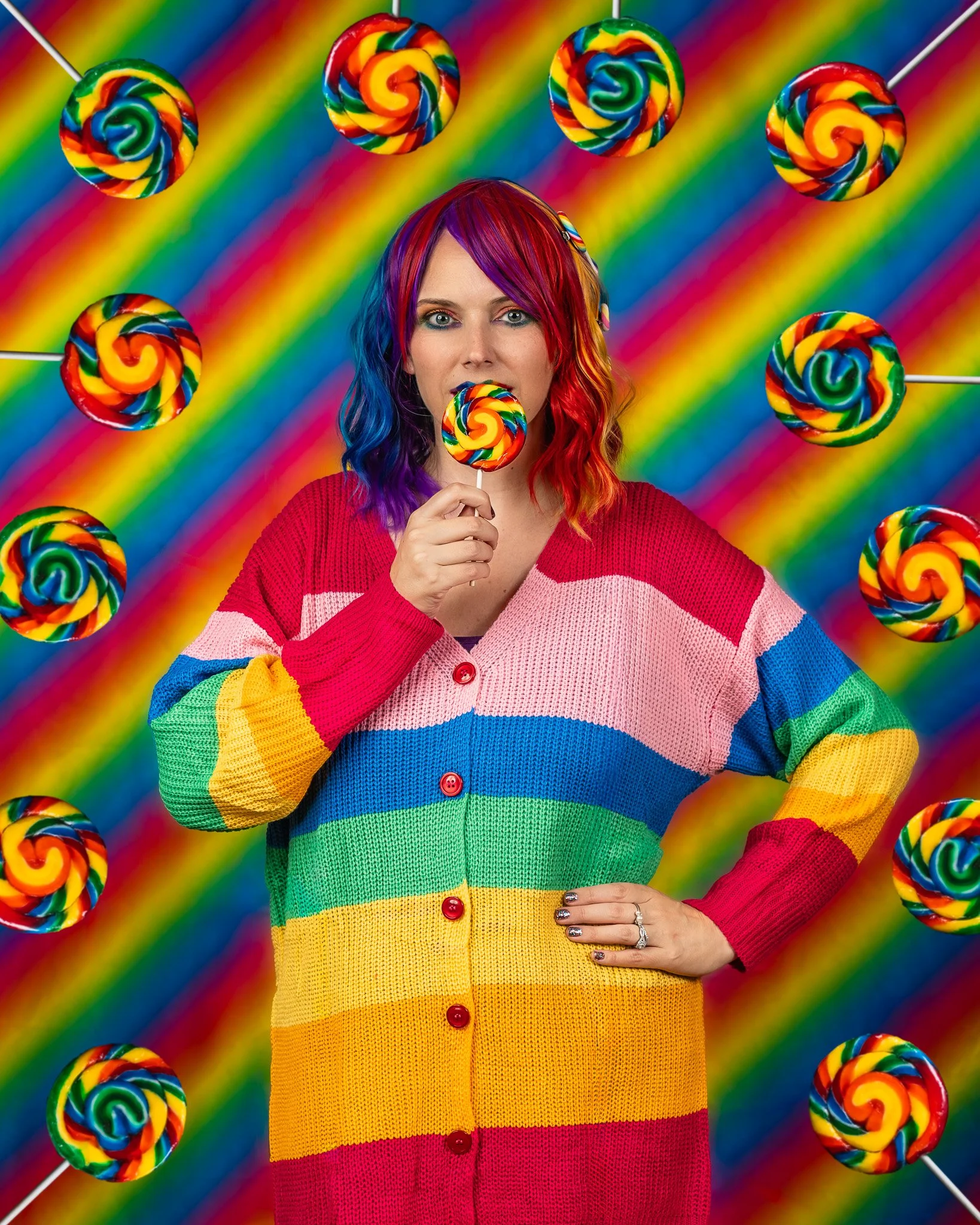
The whole month of September in our Project 52 is about exploring colors in our work. Just like any choice in photography, our use of color can be a powerful tool. Every color has an emotional connotation that can determine the intention of the image. Learning how to use colors to your advantage can make a huge difference in your work.
Last week we focused on warm colors, which are reds, oranges and yellows. These colors convey feelings of warmth, energy, and comfort. Look at how the p52 participants used warm colors and try to determine what their intentions were with their color choices.
xo,
Angie Mahlke
On the blog
*
On the blog *

Get Free Resources!
Sign up for our mailing list to stay in-the-know about our latest free resources, available courses and blog posts!