

Welcome to The Framed Focus Blog!
52 Clicks | Week 39 | Cool Colors
52 Clicks | Week 39 | Cool Colors
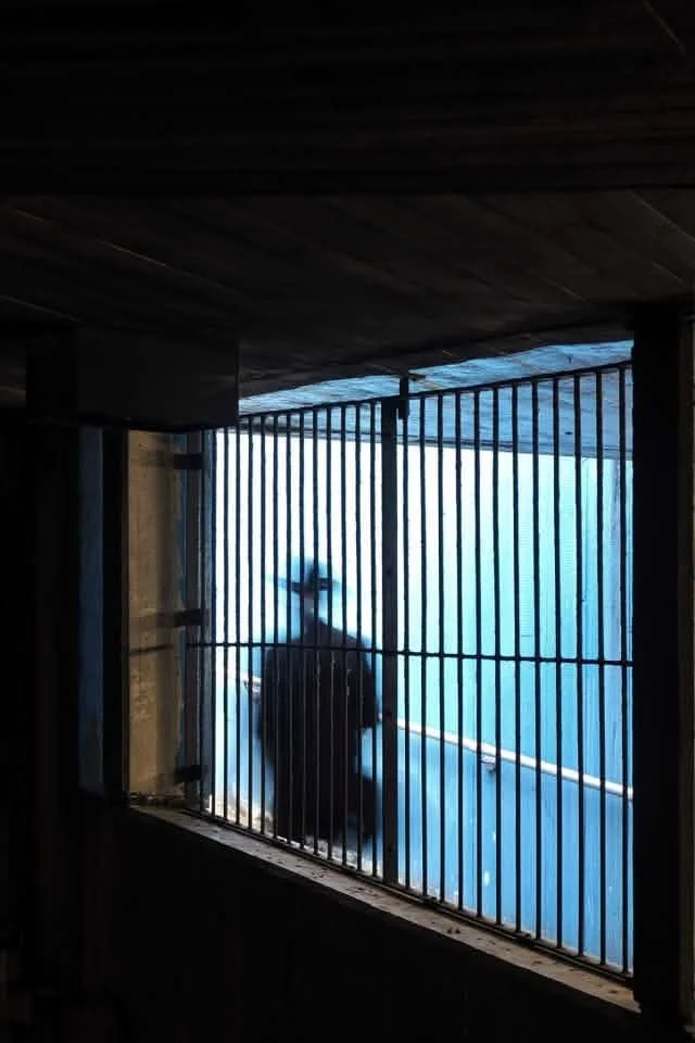
We finished up our month of color with the serenity of the cool temperature. Whereas warm colors give energy and excitement, cool colors are calm, tranquil and sometimes even melancholy. Use blues, greens and purples if this is the mood you're going for.
The Project 52 participants certainly understood the assignment. You'll notice the peaceful theme throughout their work below.
So...where do you stand? Warm or cool colors?
xo,
Angie Mahlke
52 Clicks | Week 38 | Warm Colors
52 Clicks | Week 38 | Warm Colors
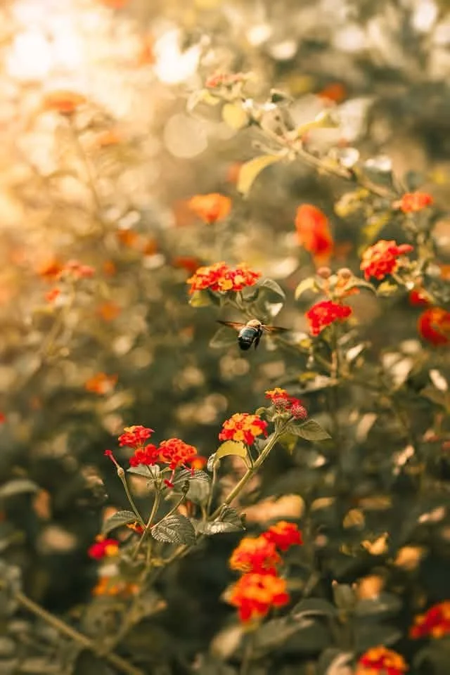
The great photography debate of whether you're Team Golden Hour or Team Blue Hour can be dwindled down warm versus cool. The warmth of golden hour or the cool temperatures of blue hour...where do you fall?
You'll see a lot of examples from the Project 52 participants this week utilizing golden hour and the sunset for this week's theme, but of course warm colors in photography are more than just a time of day. It's the colors themselves. The vibrant reds, oranges and yellows evoke energy, passion and excitement, and can aid in creating a cozy atmosphere. Scroll through the below images to see all the ways we used warm colors last week.
xo,
Angie Mahlke
Chase the Rainbow Project | Purple
In photography, colour does far more than add visual interest. It shapes the mood of an image, draws the viewer in, and helps communicate the story. In our Chase the Rainbow project, we celebrate colour by focusing on a different shade each month. Whether that’s seeking out the colour in nature, spotting it at home, or styling a scene with thoughtfully selected props and clothing, the project encourages creativity and seeing the world through a more colourful lens.
"I finally discovered the true color of the atmosphere, it is purple!” - Claude Monet
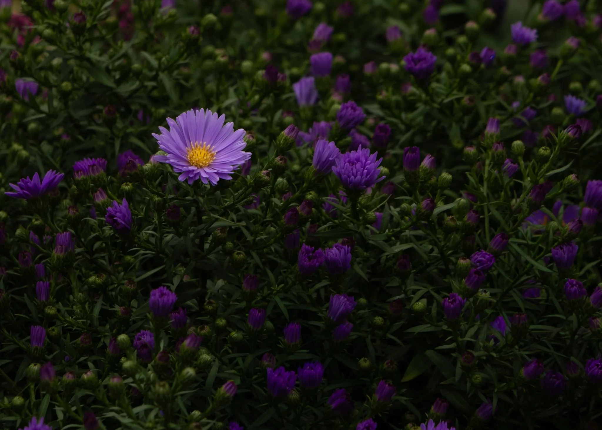
September’s colour is purple!
Blending the fiery energy of red with the calmness of blue, purple symbolises royalty, spirituality, creativity, and mystery. Rarely found in nature, it has long been associated with magic and uniqueness. Historically, purple dyes were expensive to produce, making the colour a symbol of wealth, status, and power. Today, purple continues to inspire imagination and individuality.
Enjoy looking through all our purple images.
52 Clicks | Week 37 | Monochromatic Colors
52 Clicks | Week 37 | Monochromatic Colors
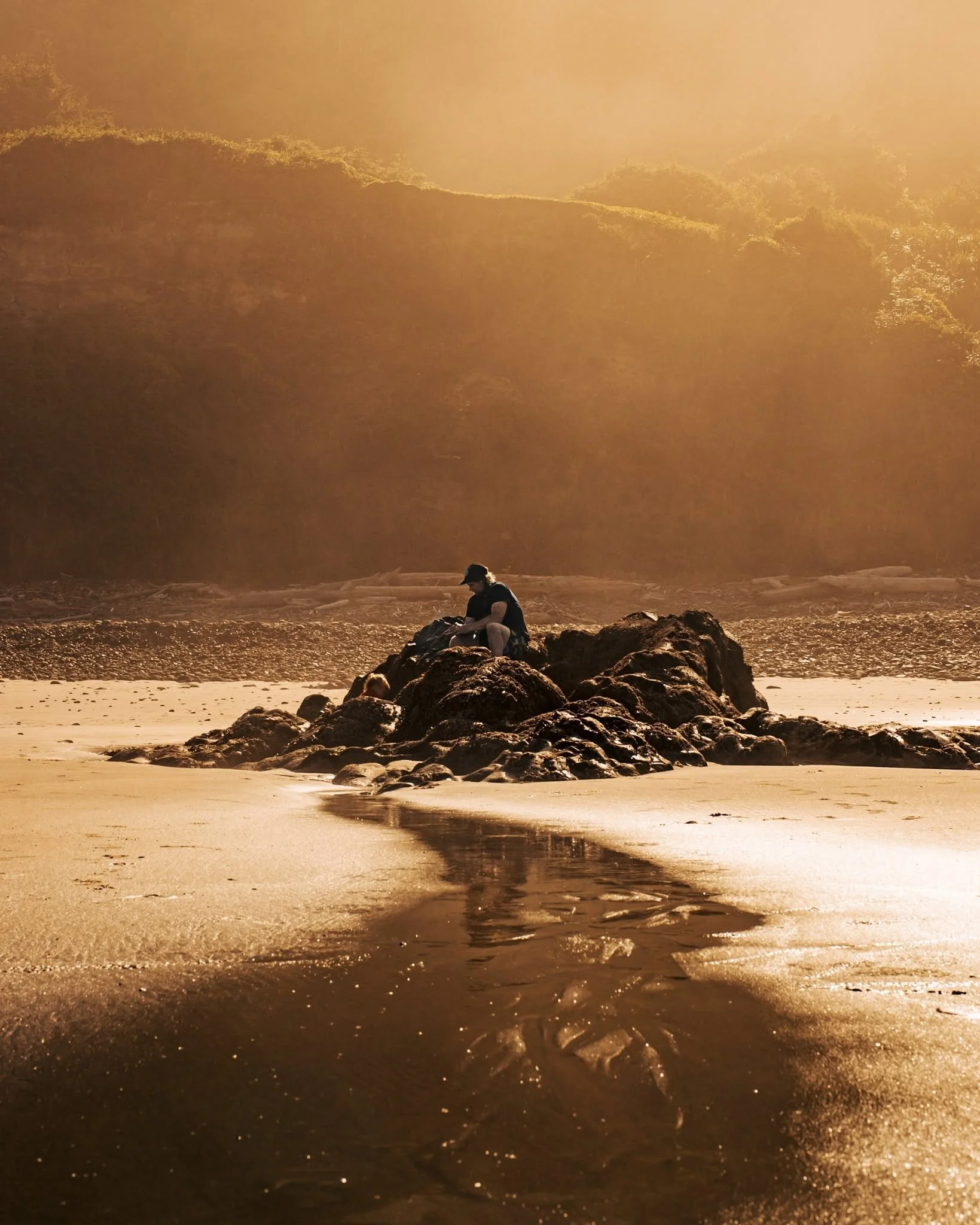
When we hear monochromatic, our thoughts often go to black and white. And although that is a facet of the monochromatic color scheme, it doesn't encompass the entirety of it. It's defined as using a single base hue with its different tints, shades and tones. In other words, color! Not the absence of it but rather the many different shades of one color. Since this color scheme oftentimes simplifies the composition, it allows the textures and lines and other details to do the heavy lifting.
Nature is rampant with monochromatic possibilities. That's why you'll notice a common theme among the Project 52 participant images: greens, blues and browns. How would you approach this theme? If this interests you, you're welcome to join our project.
Angie Mahlke
52 Clicks | Week 36 | Analogous Colors
52 Clicks | Week 36 | Analogous Colors
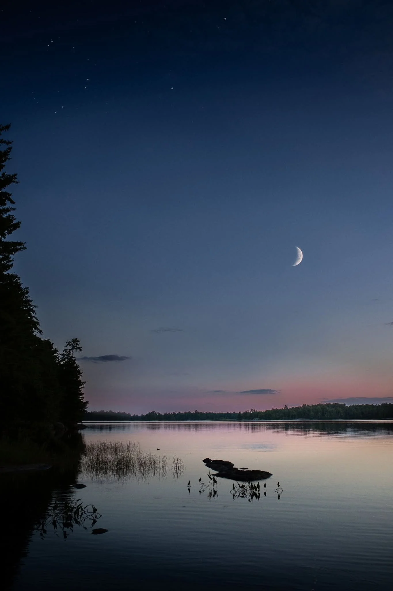
Using color psychology in your photography is great way to create emotionally impactful images. Knowing the emotional meanings of specific colors is important when using them intentionally. The analogous color scheme creates a sense of calmness with its lack of contrast. This is from using three or more colors that sit next to each other on the color wheel. Using warm or cool colors determines the emotional impact (warm = energy / cool = tranquility).
Do you gravitate toward the complementary or analogous color scheme in your work?
As always, the open invitation to join our group remains. We'd love to have you.
Angie Mahlke
52 Clicks | Week 35 | Complementary Colors
52 Clicks | Week 35 | Complementary Colors
We all know that composition and light play a huge role in photography, but one area that can sometimes be overlooked is color. Color has the power to completely shape the way an image is received. This is why our Project 52 is spending the entire month of September dipping our toes into the vast subject of color theory.
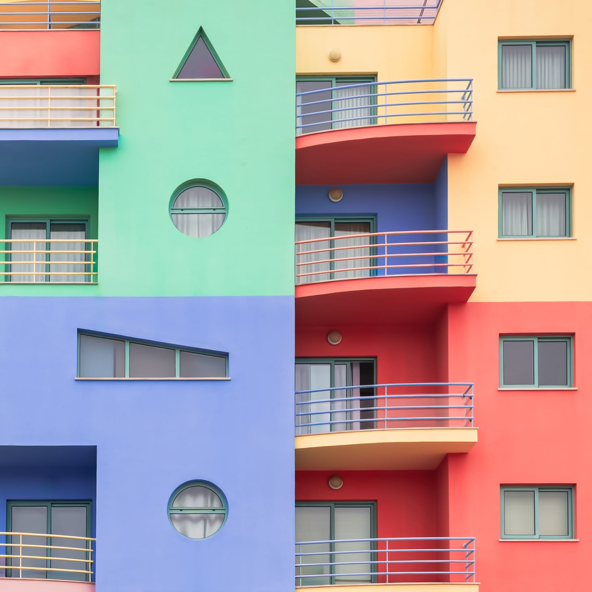
We started with complementary colors. If you think back to school learning the color wheel, you'll remember complementary colors are the ones opposite each other. Green + red is the easiest combo to find in nature. You might have to look a bit harder for blue + orange and purple + yellow. Using these color combinations is great for contrast, infusing energy, and isolating your subject.
One of the things we discussed this week in our p52 is how we often prefer colors that are slightly adjacent in the complementary color schemes, like green + pink and blue + yellow. What color combo is your favorite?
And, as always, the open invitation to join our group remains. We'd love to have you.
xo,
Angie Mahlke
52 Clicks | Week 34 | Landscape Photography
52 Clicks | Week 34 | Landscape
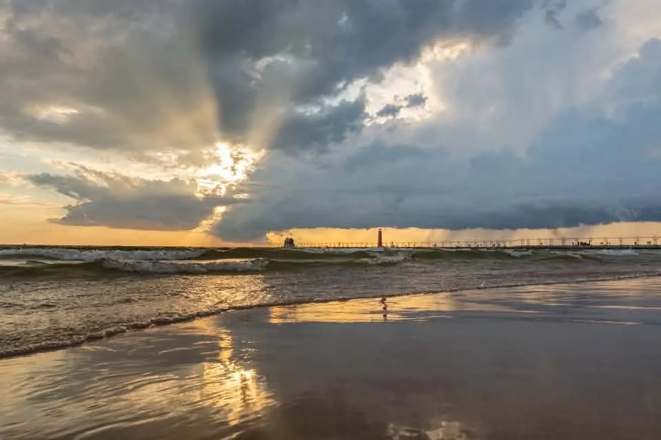
We finished up our genre sampling month with a bang! The Project 52 participants took a fairly challenging genre of landscape photography and made it look easy. And it's not even most of their usual genres! That's the fun thing about this project. We get to expand our "usuals" and push ourselves to dig deep into the depths of our creativity.
I hope you enjoy these images as much as I did because it was almost impossible to only choose a select handful to share.
As always, if this is something that interests you, it's never too late to hop in.
xo,
Angie Mahlke
My World Through the Lens | by Adelina Sulima
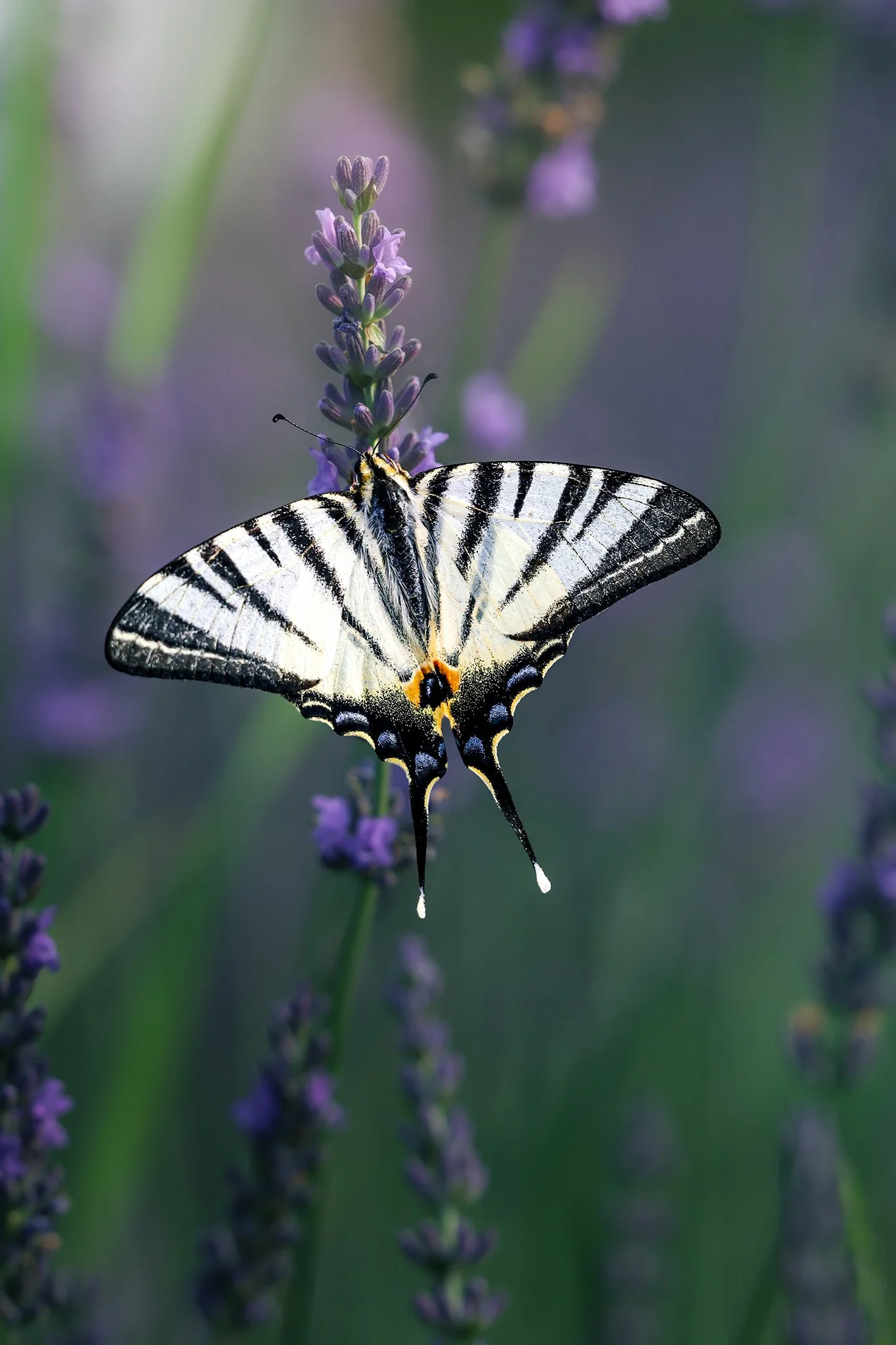
Discover nature photographer Adelina Sulima’s journey from a lifelong creative to passionate macro photographer. She shares how photographing flowers, insects, and the natural world has become a source of creativity and calm, along with five meaningful lessons nature photography has taught her.
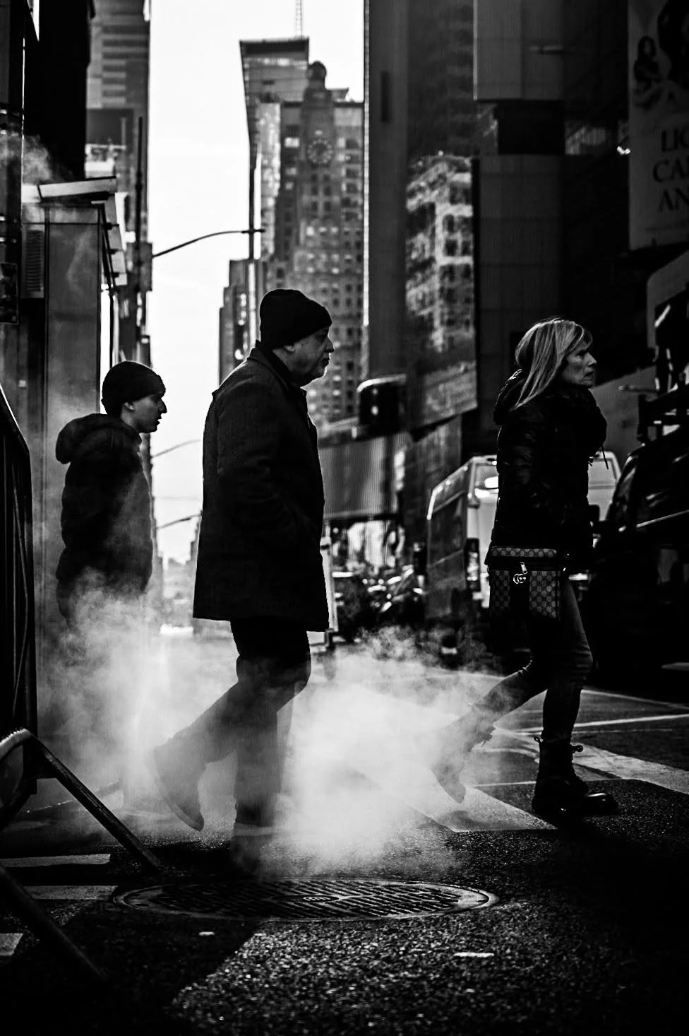
52 Clicks | Week 33 | Documentary Photography
52 Clicks | Week 33 | Documentary
Documentary photography is one of those genres that challenges photographers because we have to reel in our inclination to direct the narrative and interfere with the moment. Instead, we must simply let the moments unfold while we watch silently behind our cameras. It's a hard thing for most of us to do because we're control freaks and we want to manage all the details. But that's also what makes the genre so special. The captured moments are authentic. What we see is what occurred naturally.
See what happened when nature, portrait, street and lifestyle photographers were quiet observers behind their cameras and simply captured the moment. And if this appeals to you, join our Project 52. All are welcome, and it's never too late to hop in.
xo,
Angie Mahlke
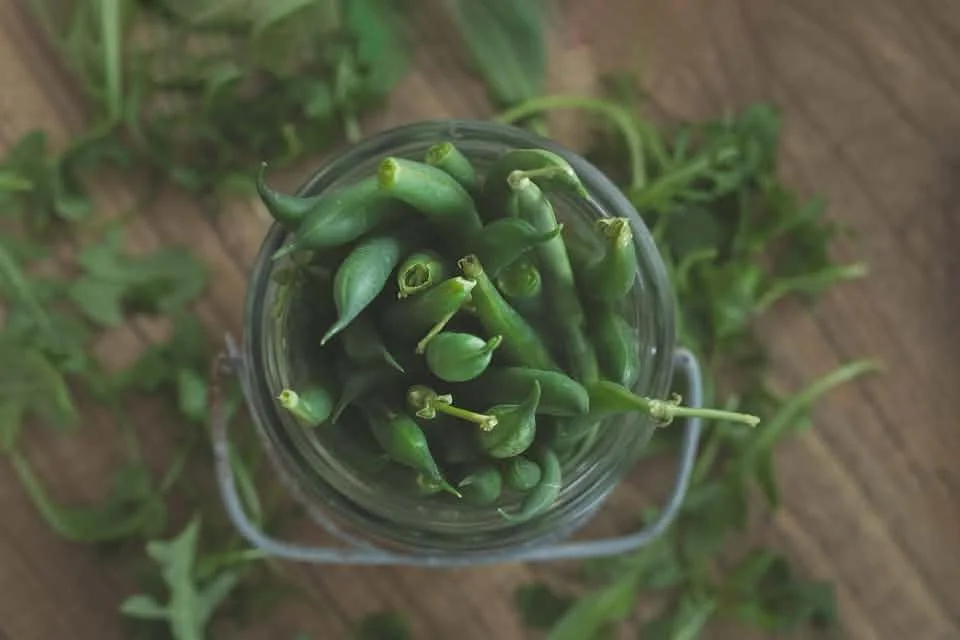
52 Clicks | Week 32 | Food Photography
52 Clicks | Week 32 | Food Photography
Another week stepping outside our comfort zones in our Project 52. We're sampling different genres all month, and last week we tackled the very yummy but tricky food photography. One of the most common concerns from the p52 participants was the styling struggles. When we think of food photography, we often imagine the pretty flatlays with elaborate setups. If you've ever attempted one of these yourself, you know how very hard they are! Kudos to food photographers for making it look so easy because it definitely is not. But food photography goes beyond fancy setups, and it was fun to see how everyone made this theme their own. Be warned: you won't walk away from this blog without a major hankering for some food.
Are you looking for a little push in your creativity? If so, this is the right place to find it.
xo,
Angie Mahlke
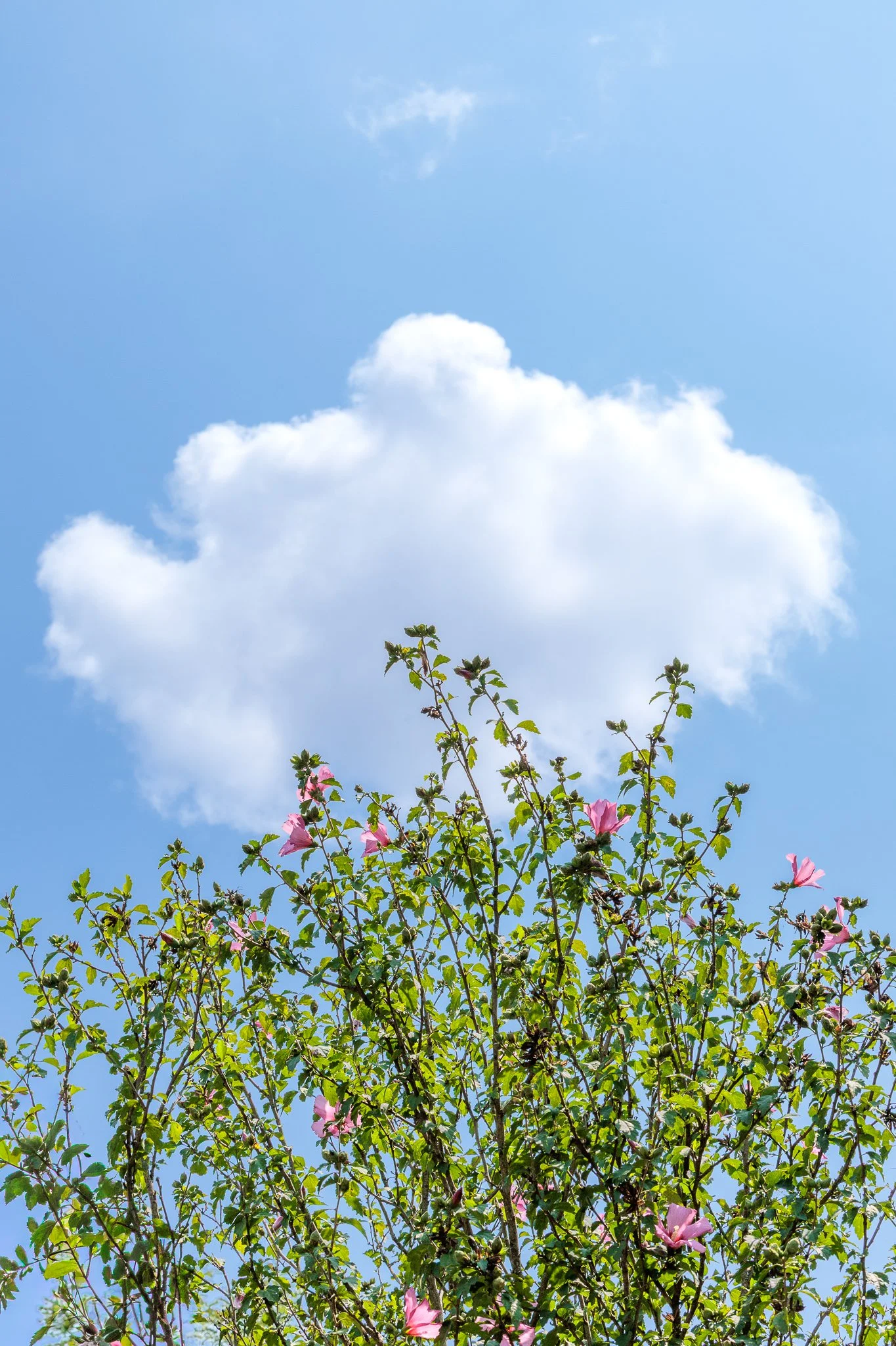
Chase the Rainbow Project | Sky Blue
In photography, colour does far more than add visual interest. It shapes the mood of an image, draws the viewer in, and helps communicate the story. In our Chase the Rainbow project, we celebrate colour by focusing on a different shade each month. Whether that’s seeking out the colour in nature, spotting it at home, or styling a scene with thoughtfully selected props and clothing, the project encourages creativity and seeing the world through a more colourful lens.
“Let the blue of the sky and ocean take your blue away when you feel blue” - Munia Khan
August’s colour is sky blue!
Reminding us of vast, clear skies, this gentle shade of blue symbolises freedom, optimism, and possibility. It encourages us to look ahead with a sense of hope, evoking feelings of endless potential and brighter days to come. Its softness inspires feelings of peace and tranquillity, while also representing innocence, clarity, and a fresh perspective. It’s a colour that invites us to pause, breathe, and embrace the possibilities that lie ahead.
Enjoy looking through all our sky blue images.
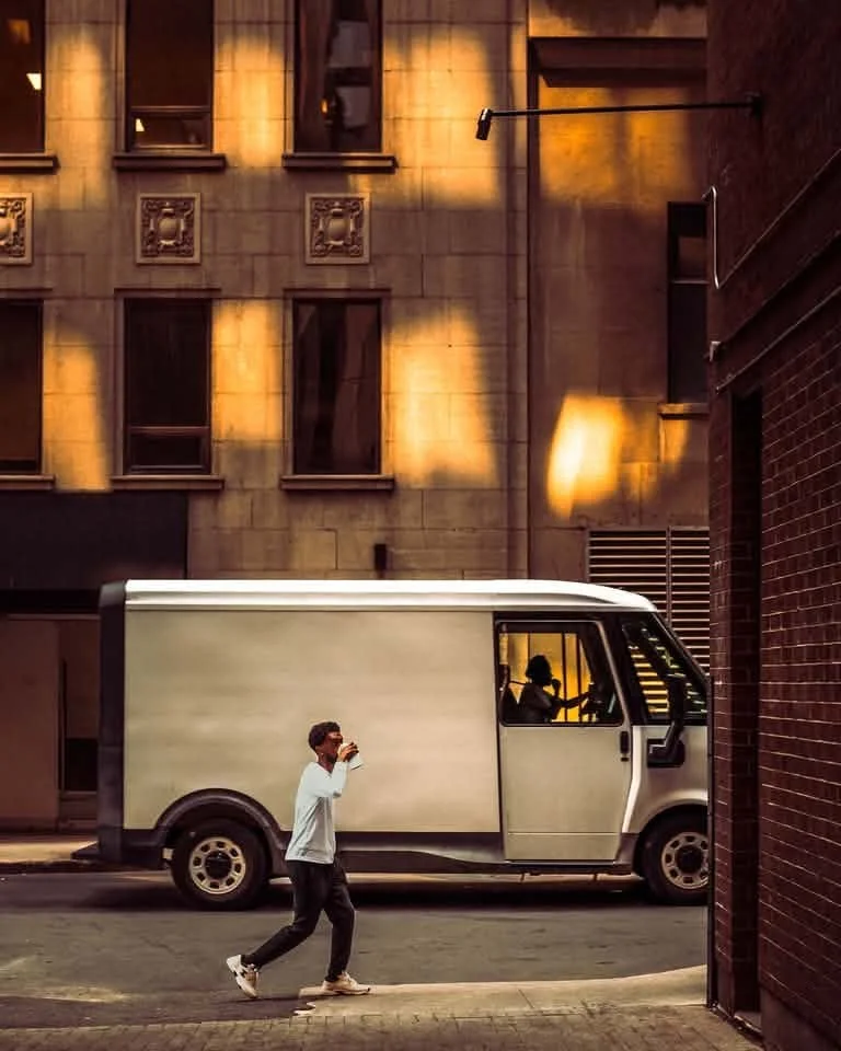
52 Clicks | Week 31 | Street Photography
52 Clicks | Week 31 | Street Photography
Our Project 52 group is full of a wide range of photographers, from landscape and nature to documentary and portrait, and everything else in between. And every week, we're treated to how each and every one of us interprets the themes in our own style and genre. But this month, we're going out of our comfort zones and stepping inside different genres every week. August is all about genre sampling.
The first one was street photography, and it certainly didn't disappoint. Whether the p52 participants were in a big city or a more rural setting, they captured a slice of life in beautiful ways.
What genre are you itching to try out? If you'd like a push like this, feel free to join our project!
xo,
Angie Mahlke
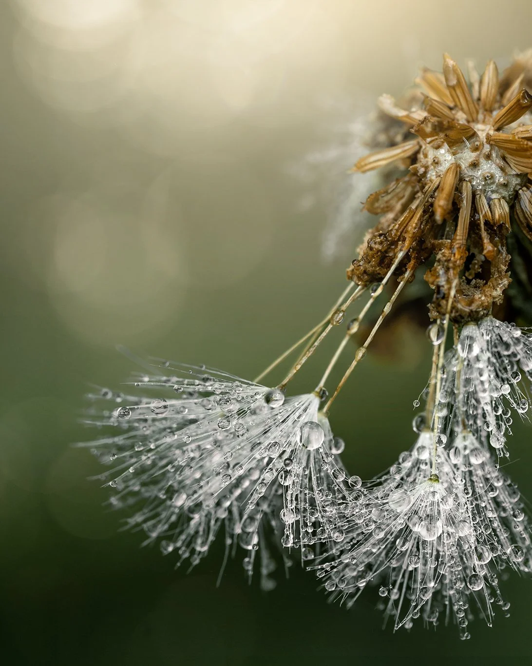
The Case for Slowing Down | by Holly Awwad
Photography doesn't have to be about rushing from one subject to the next. Discover how slowing down, observing more intentionally, and reconnecting with nature can transform both your photography and your creative life.
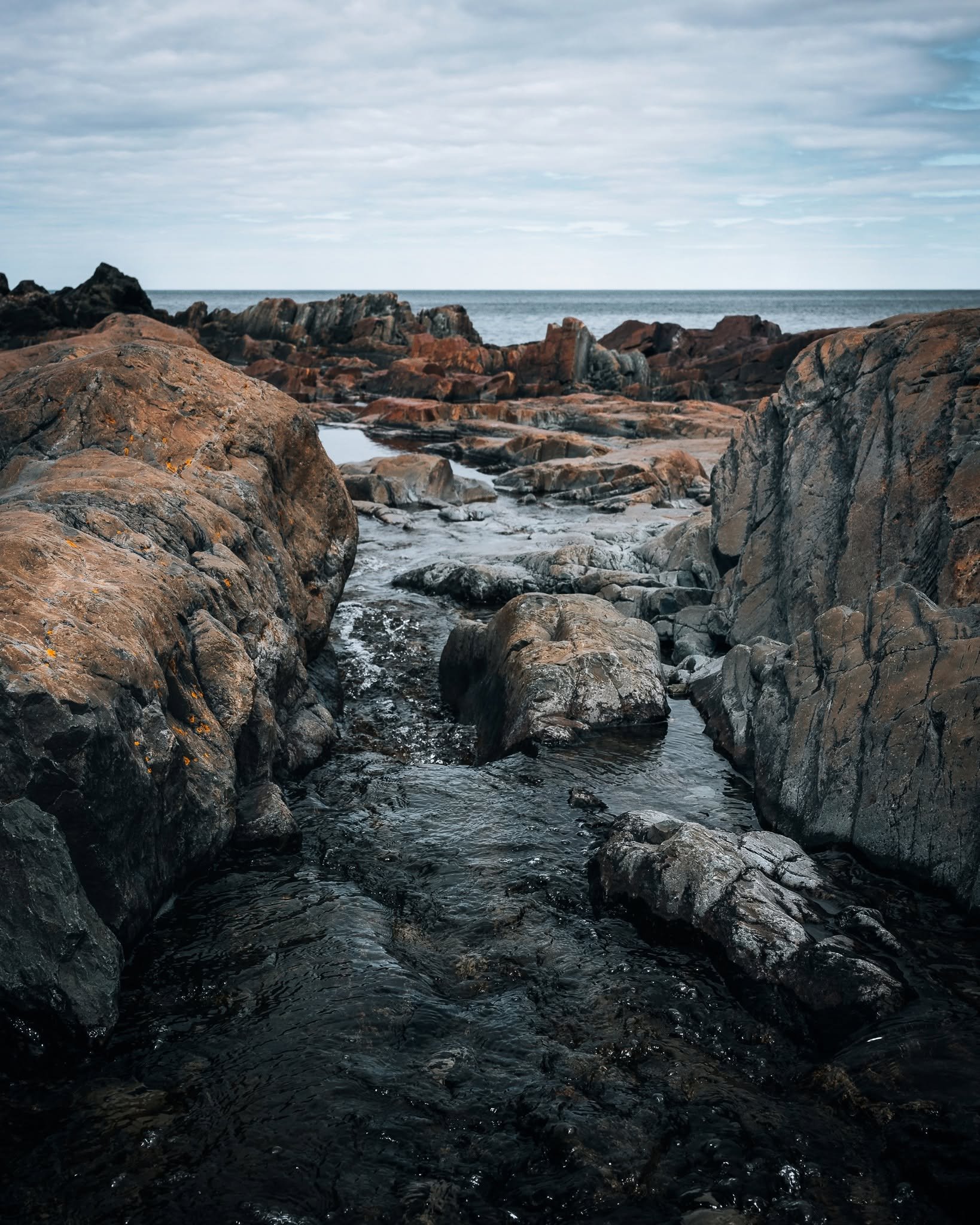
52 Clicks | Week 30 | Depth
52 Clicks | Week 30 | Depth
We finished off our month of perspectives in our Project 52 last week with our final theme: depth. Creating depth in your images is like tricking the eye into believing the pictures are really 3D. Some ways to combat the flat, 2D quality of your work is to use layers, creative perspectives, depth of field, framing and so many other creative techniques. How do you like to create depth?
If you're craving some creativity in your life, consider hopping in our P52. Next up is a month of sampling different genres!
xo,
Angie Mahlke
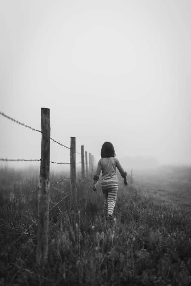
52 Clicks | Week 29 | Leading Lines
52 Clicks | Week 29 | Leading Lines
You know what's fun about leading lines? Anything can be used, anything goes! Fences, lines on the road, trees, buildings, people, footprints. Anything that helps guide your eye through the frame or to emphasize a subject/object/point. The Project 52 participants were creative in their use of lines in last week's photography prompt on perspectives.
How do you use leading lines in your work? If this is a challenge that interests you, feel free to hop in our ongoing project! All are welcome.
xoxo,
Angie Mahlke
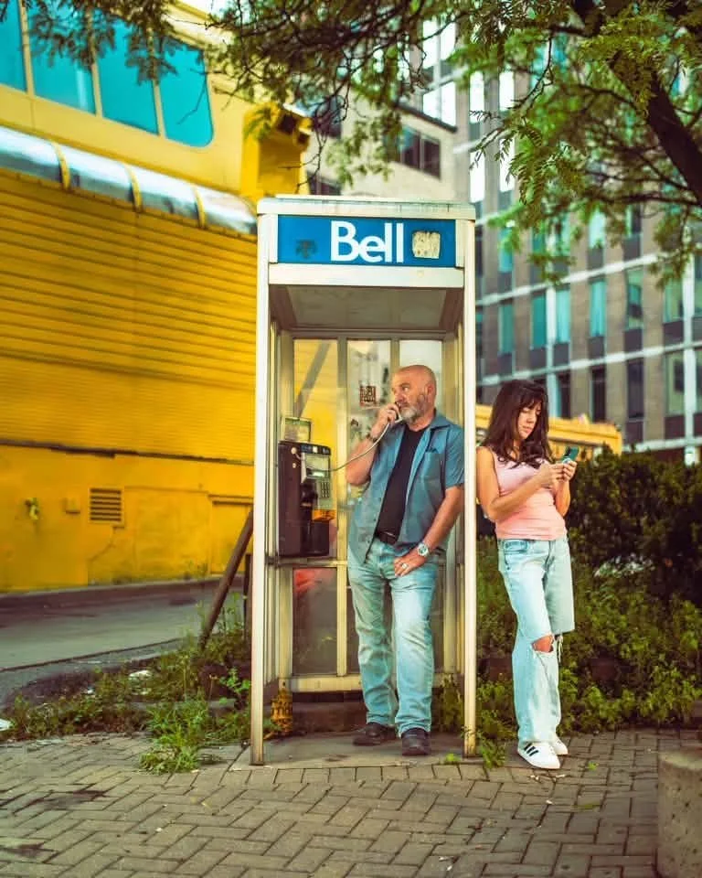
52 Clicks | Week 28 | Juxtaposition
52 Clicks | Week 28 | Juxtaposition
Juxtaposition is just a fancy term for using contrasting elements (big/small, old/young, right/wrong. animate/inanimate, etc) in your frame. You can use it to evoke emotions, tell a story, add emphasis, infuse humor, highlight irony and much more. If you think you've never used this in your work before, you're likely wrong. You're probably using it without realizing it. That photo you took of your kid on a hill with a big sky behind them? Juxtaposition. That photo of your mom cuddling your baby? Juxtaposition. That photo of an old building among a bunch of new ones? Juxtaposition. Since you're already using it unintentionally, imagine if you used it intentionally?
The Project 52 participants dug deep last week to do just that, and it shows! Look at their work and see how using juxtaposition can cause tension, emphasize a certain point, aid in storytelling and much more. And if this is something that calls to you, you might just be ready to join a project like this. If so, it's not too late.
xoxo,
Angie Mahlke
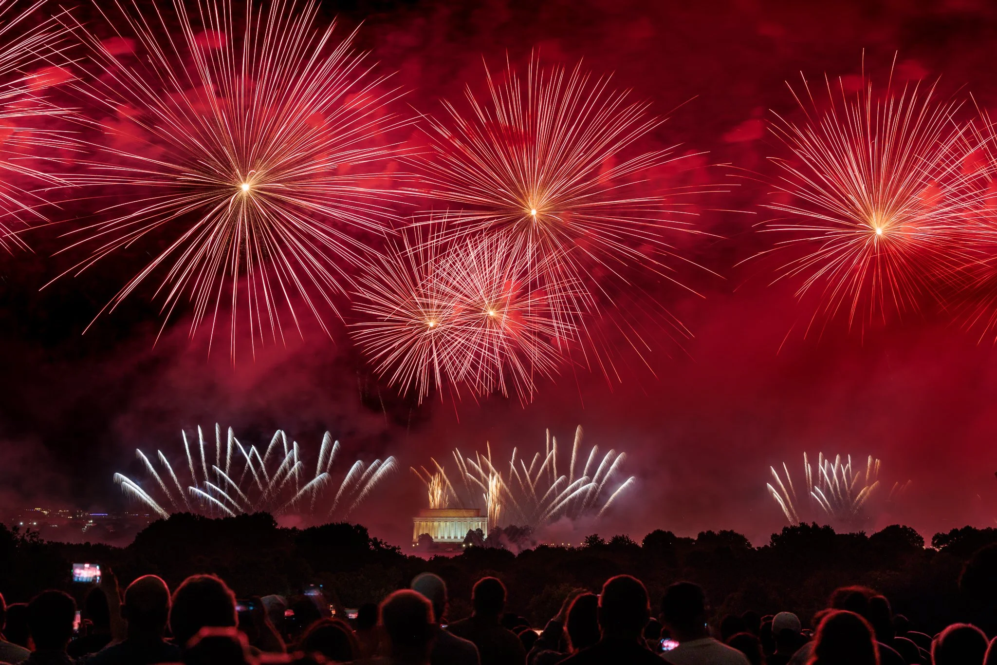
Chase the Rainbow Project | Red
In photography, colour does far more than add visual interest. It shapes the mood of an image, draws the viewer in, and helps communicate the story. In our Chase the Rainbow project, we celebrate colour by focusing on a different shade each month. Whether that’s seeking out the colour in nature, spotting it at home, or styling a scene with thoughtfully selected props and clothing, the project encourages creativity and seeing the world through a more colourful lens.
“There is certainly a red for everyone” - Christian Dior
July’s colour is red!
A bold, vibrant colour that symbolises passion, energy and strength, red naturally draws attention, making it a popular choice for branding, warning signs, and impactful designs. Red can evoke powerful emotions, from love and determination to urgency and anger. Reminding us of fire, roses, and autumn leaves, it conveys warmth and vitality, while its intensity gives it an unforgettable presence.
Enjoy looking through all our red images.
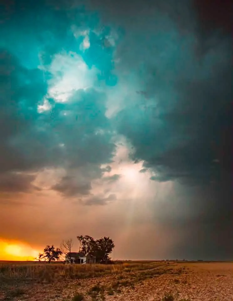
52 Clicks | Week 27 | Negative Space
52 Clicks | Week 27 | Negative Space
Negative space is a great way to emphasize a certain mood, focus attention on the subject, highlight scale, and be creative in your composition. It's easy to hear the term "negative space" and think a majority of your frame needs to be empty or blank, but it's really more about the breathing room around the subject. This could be an uncluttered background, textured space (think: big sky, grass, trees, water, etc) or a blurred background that allows the focal point to stand out.
Look at the various ways the Project 52 participants used negative space last week. Is this a compositional tool you use often? If not, I encourage you to experiment with it! We're focusing on different perspectives all month, so feel free to jump in our p52.
xoxo,
Angie Mahlke
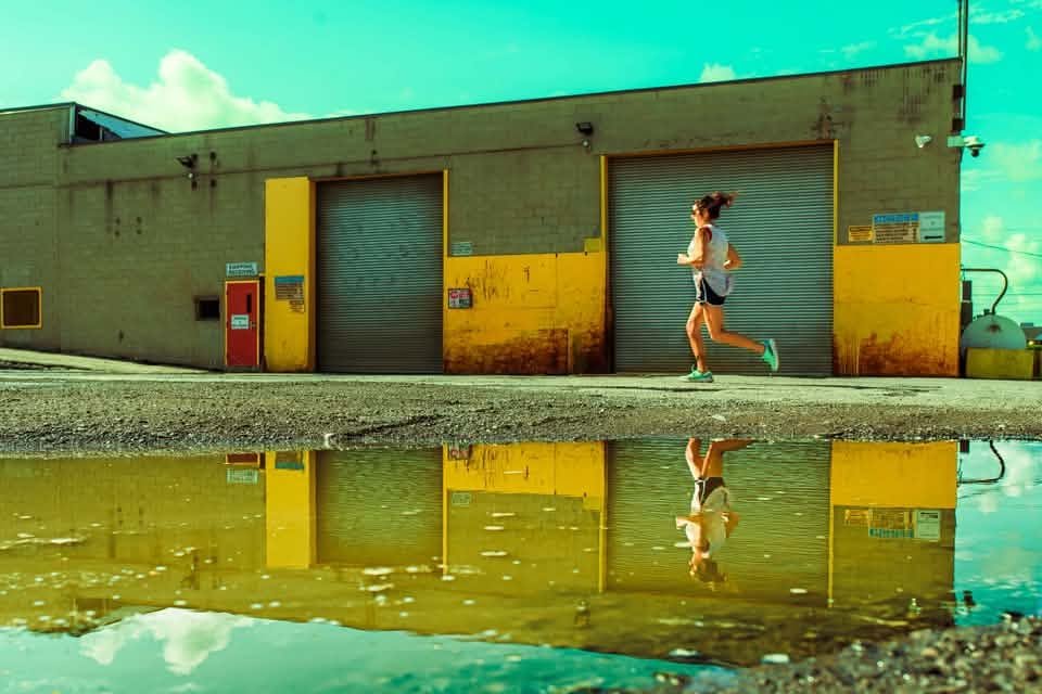
52 Clicks | Week 26 | Frame Within a Frame
52 Clicks | Week 26 | Frame Within a Frame
For the month of July, we will be exploring different perspectives in our Project 52. The first one was to focus on adding an additional frame within the image. The frame could be super obvious (think: door frames, mirrors, windows, etc). Or it could be something more implied (think: layering with foreground/background items). Or the framing could be something creative (think: light painting, double exposure, etc). Whatever the chosen frame, the p52 participants showed off last week with their images.
If you're wanting a challenge like this, there's still time to hop in the project with us.
xoxo,
Angie Mahlke
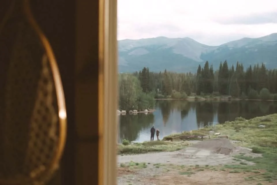
52 Clicks | Week 25 | Favorite Place
52 Clicks | Week 25 | Favorite Place
If you had to choose a favorite place, where would it be? That was the final theme for our favorites month in our Project 52. The p52 participants chose either a favorite place they like to take pictures or a place that is special to them.
It's been a fun month exploring our favorite things, and I'm going to be a little sad to move on. But we have lots of weeks left in the project with plenty of other fun things to dig into. If this appeals to you, join us!
xoxo,
Angie Mahlke
On the blog
*
On the blog *

Get Free Resources!
Sign up for our mailing list to stay in-the-know about our latest free resources, available courses and blog posts!