52 Clicks | Week 35 | Complementary Colors
We all know that composition and light play a huge role in photography, but one area that can sometimes be overlooked is color. Color has the power to completely shape the way an image is received. This is why our Project 52 is spending the entire month of September dipping our toes into the vast subject of color theory.
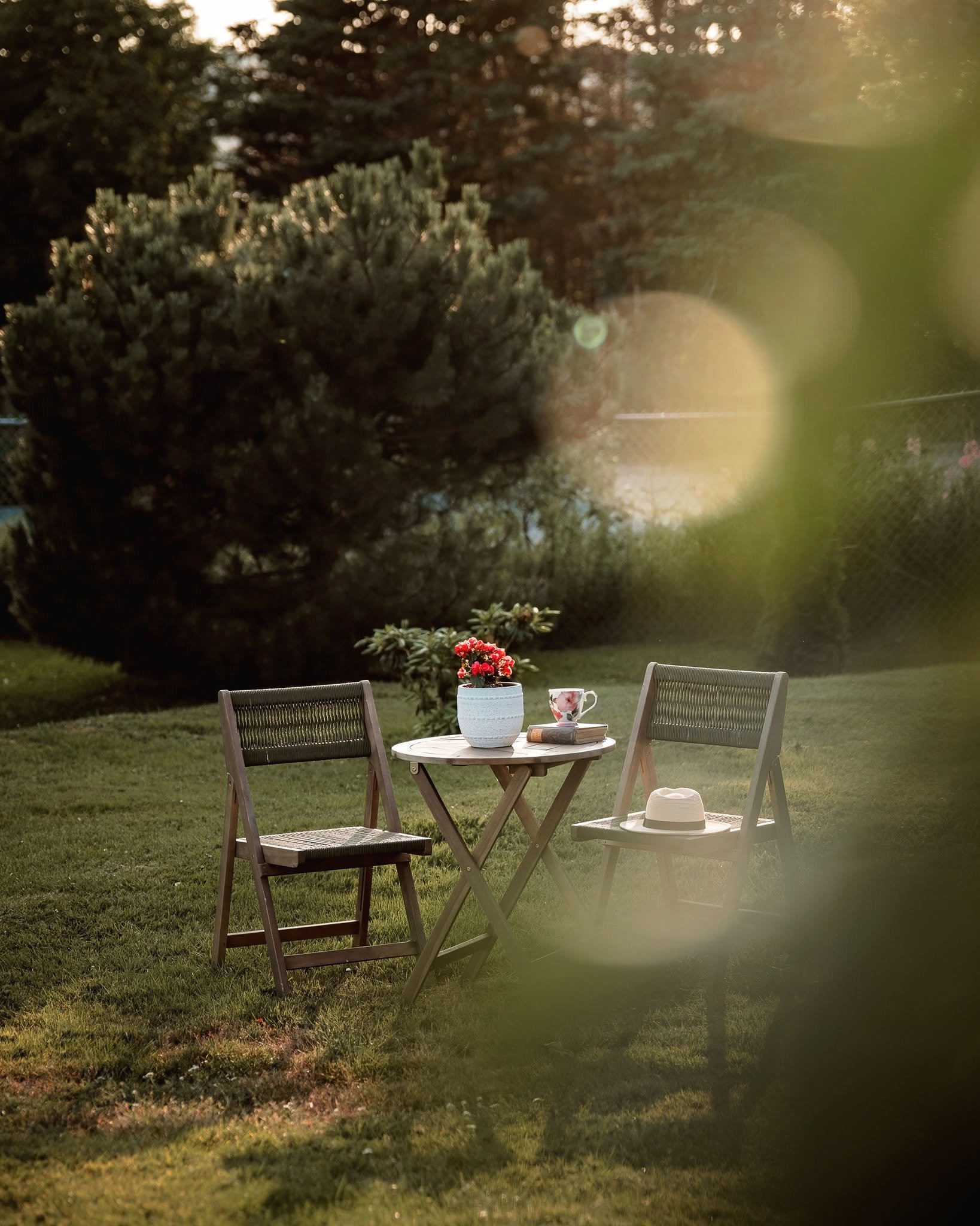
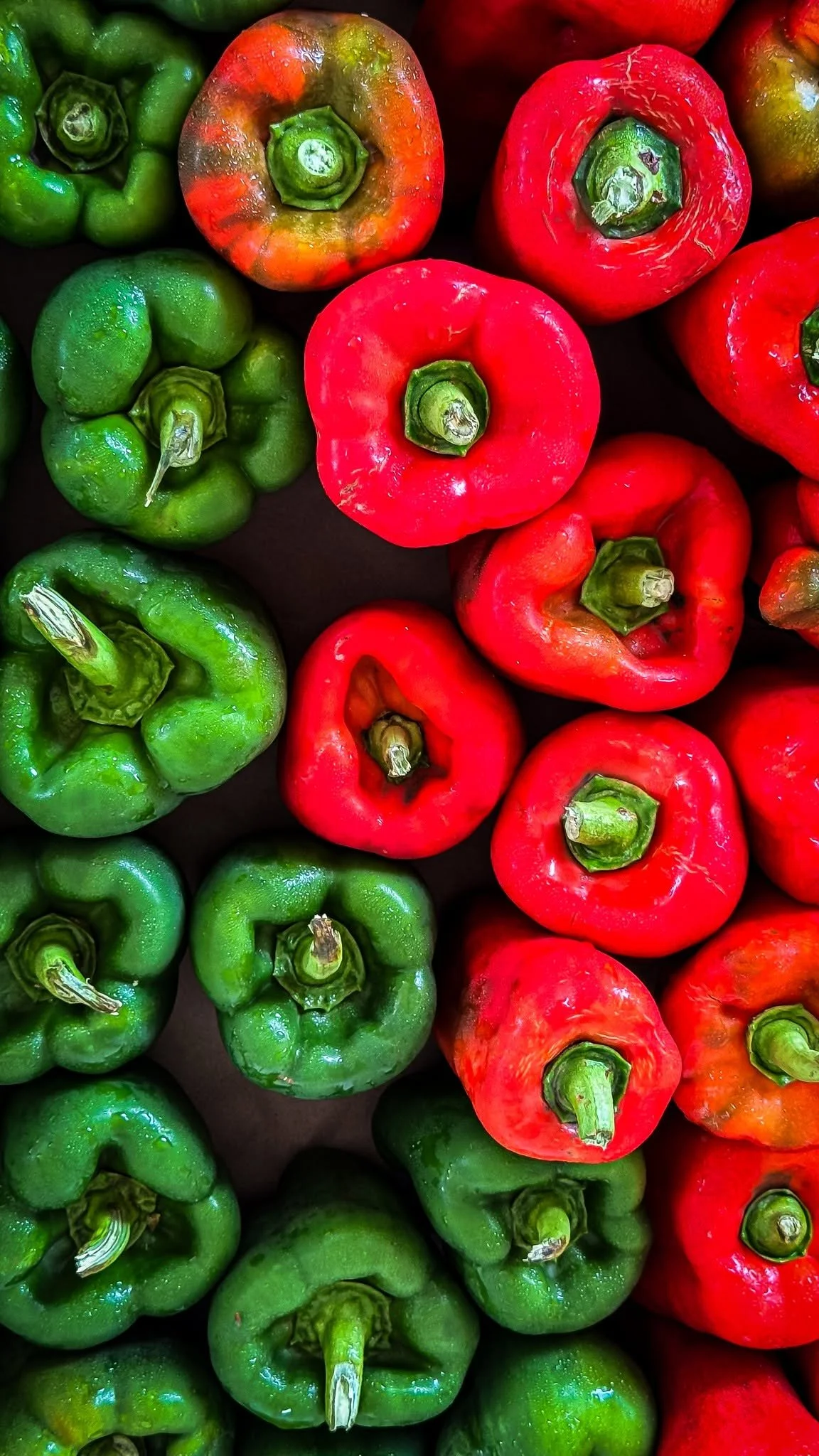
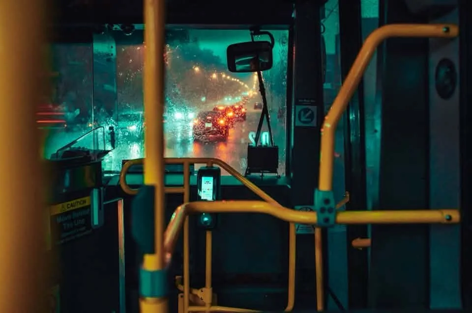
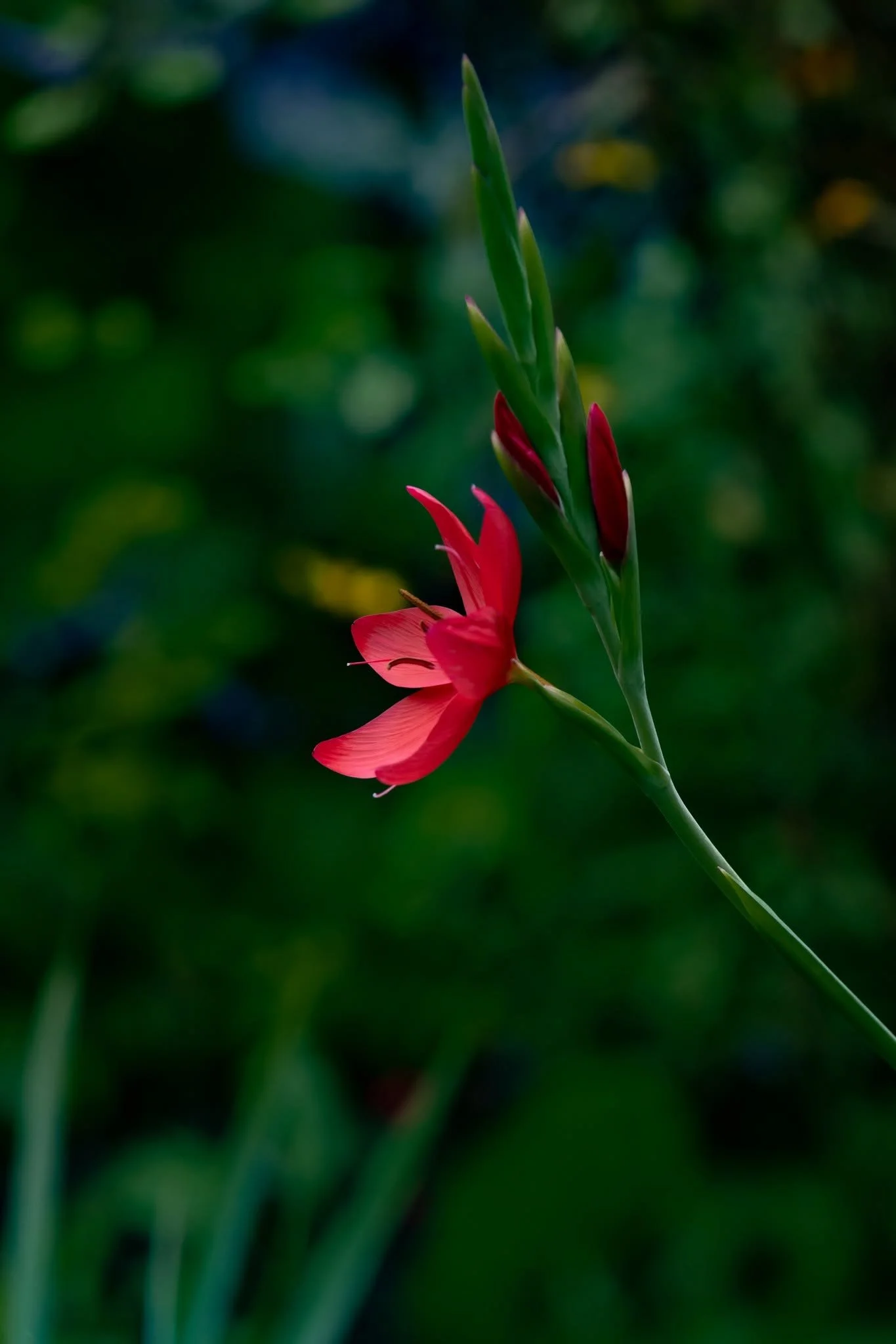
We started with complementary colors. If you think back to school learning the color wheel, you'll remember complementary colors are the ones opposite each other. Green + red is the easiest combo to find in nature. You might have to look a bit harder for blue + orange and purple + yellow. Using these color combinations is great for contrast, infusing energy, and isolating your subject.
One of the things we discussed this week in our p52 is how we often prefer colors that are slightly adjacent in the complementary color schemes, like green + pink and blue + yellow. What color combo is your favorite?
And, as always, the open invitation to join our group remains. We'd love to have you.
Angie Mahlke
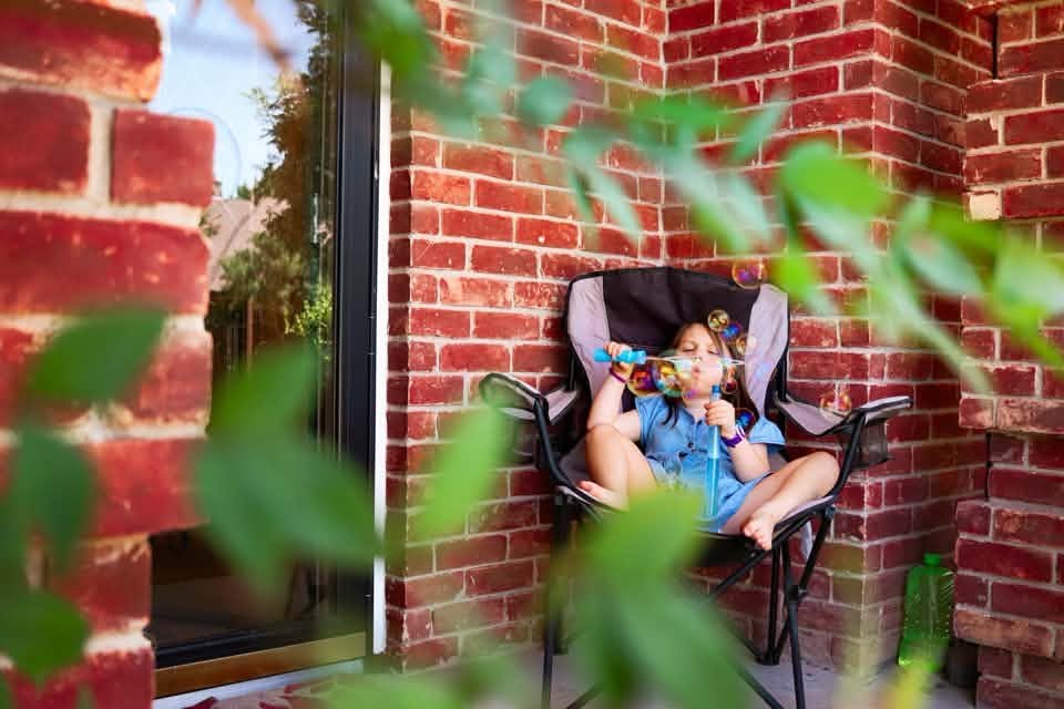
Abby Goerz @abbygoerz
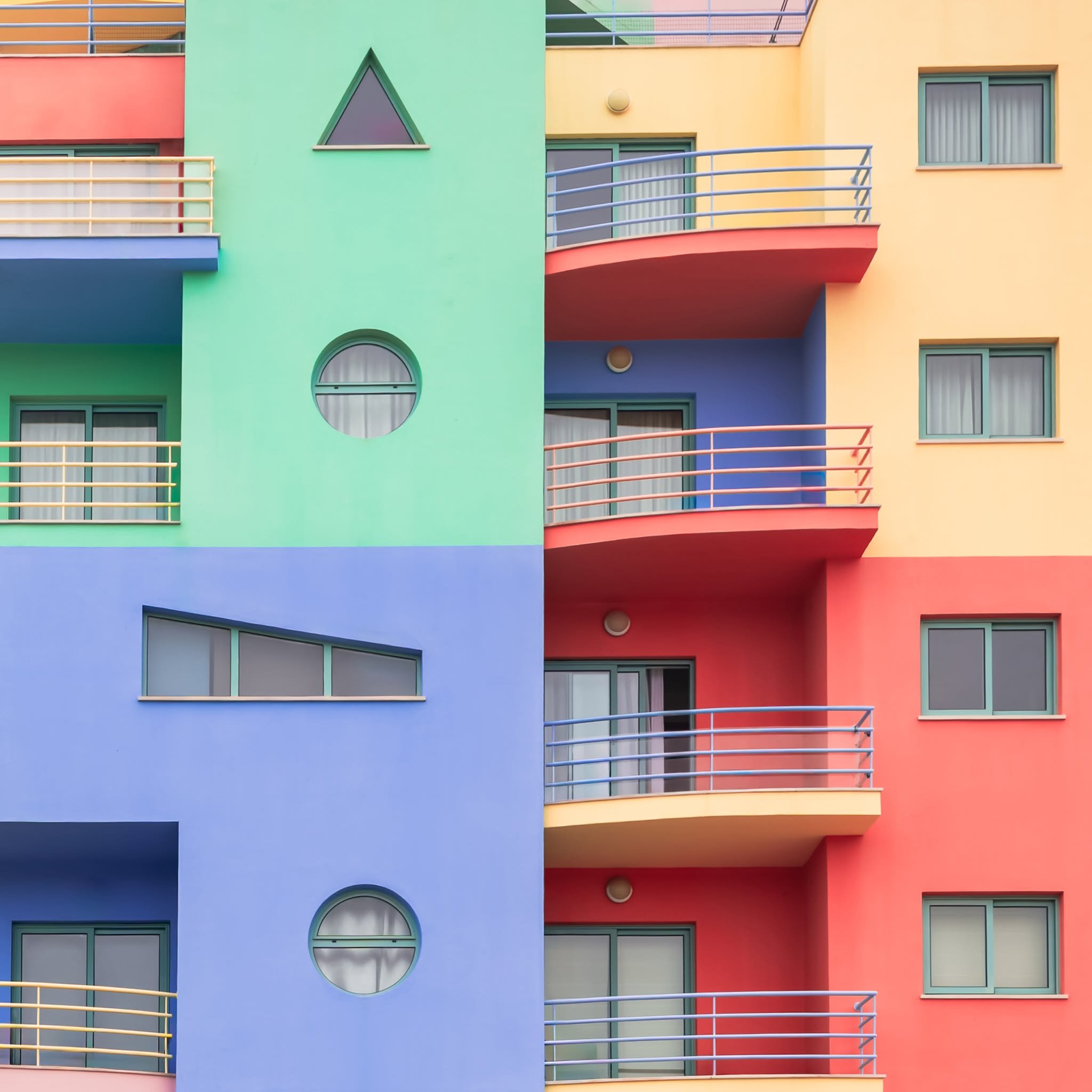
Abi Coop @abicoop28
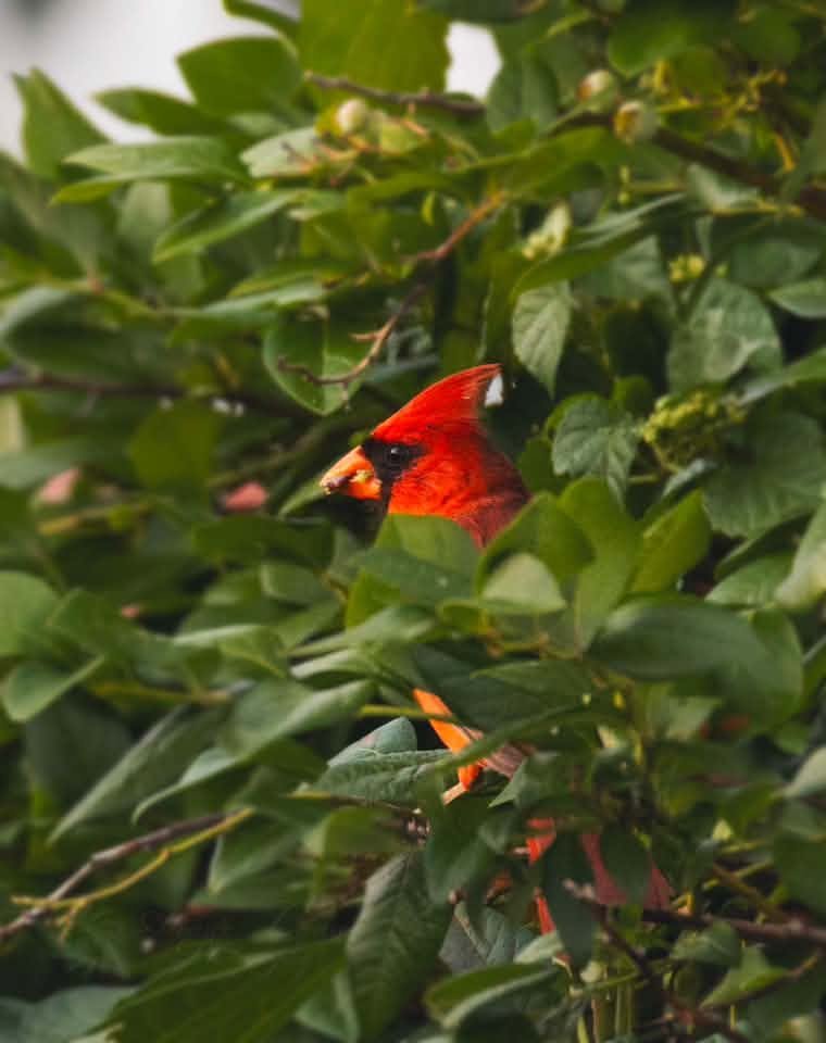
Aimee Garrity @aimee_lynn_photography
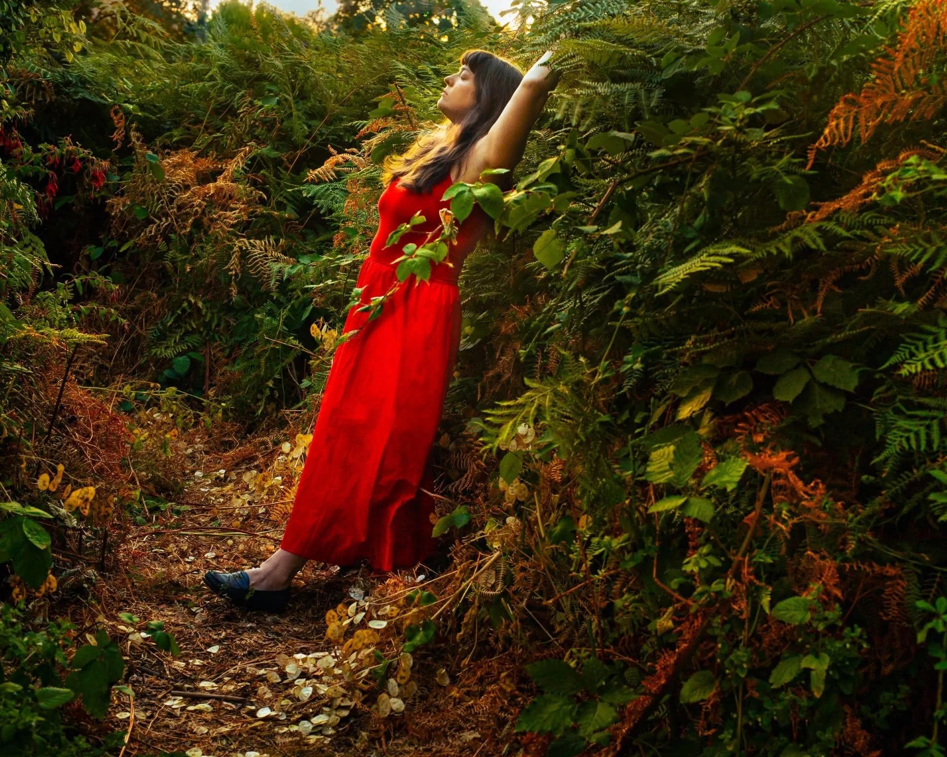
Brie Lee @littlemooninjune
Carol Ann Ryan @carol_ann_ryan_photography
Christina Kaplan @christinamariephotographyri
Christine McRoberts @christinemcroberts
Cindy Borbridge @seasaltphotographybc
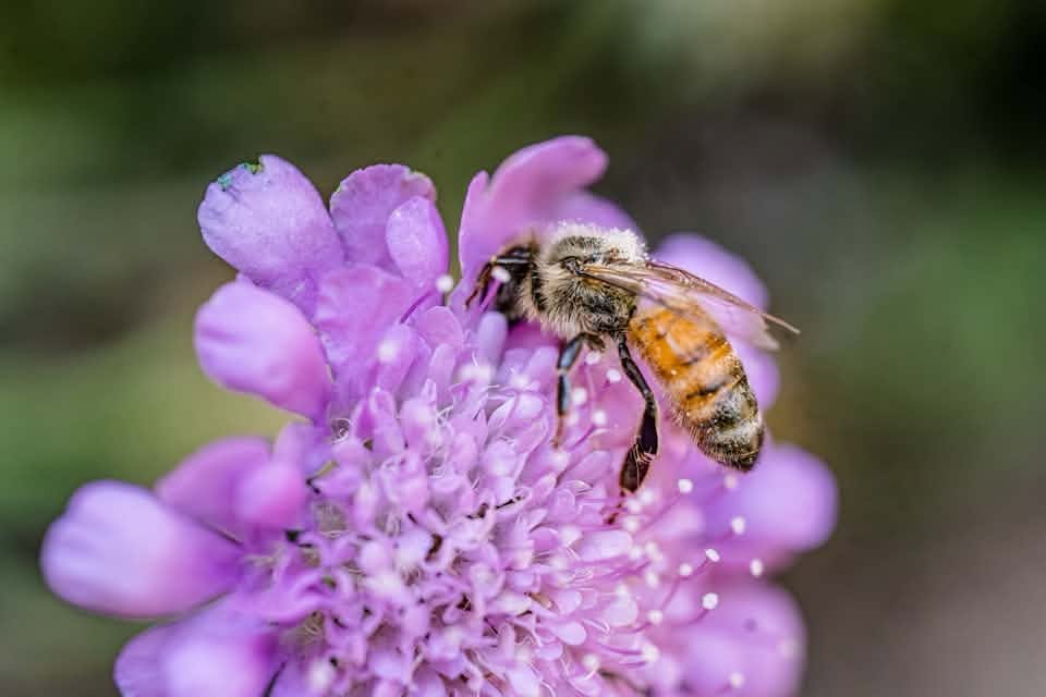
Colette Nederhoff @cohappinest
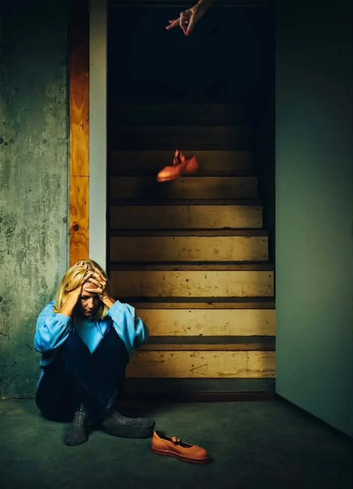
Diana Johnson @dianaljohnsonphotography
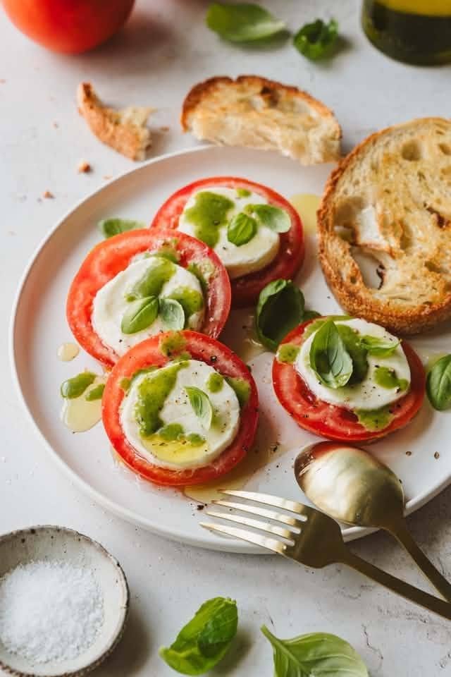
Dorene Hookey @dorenehookey
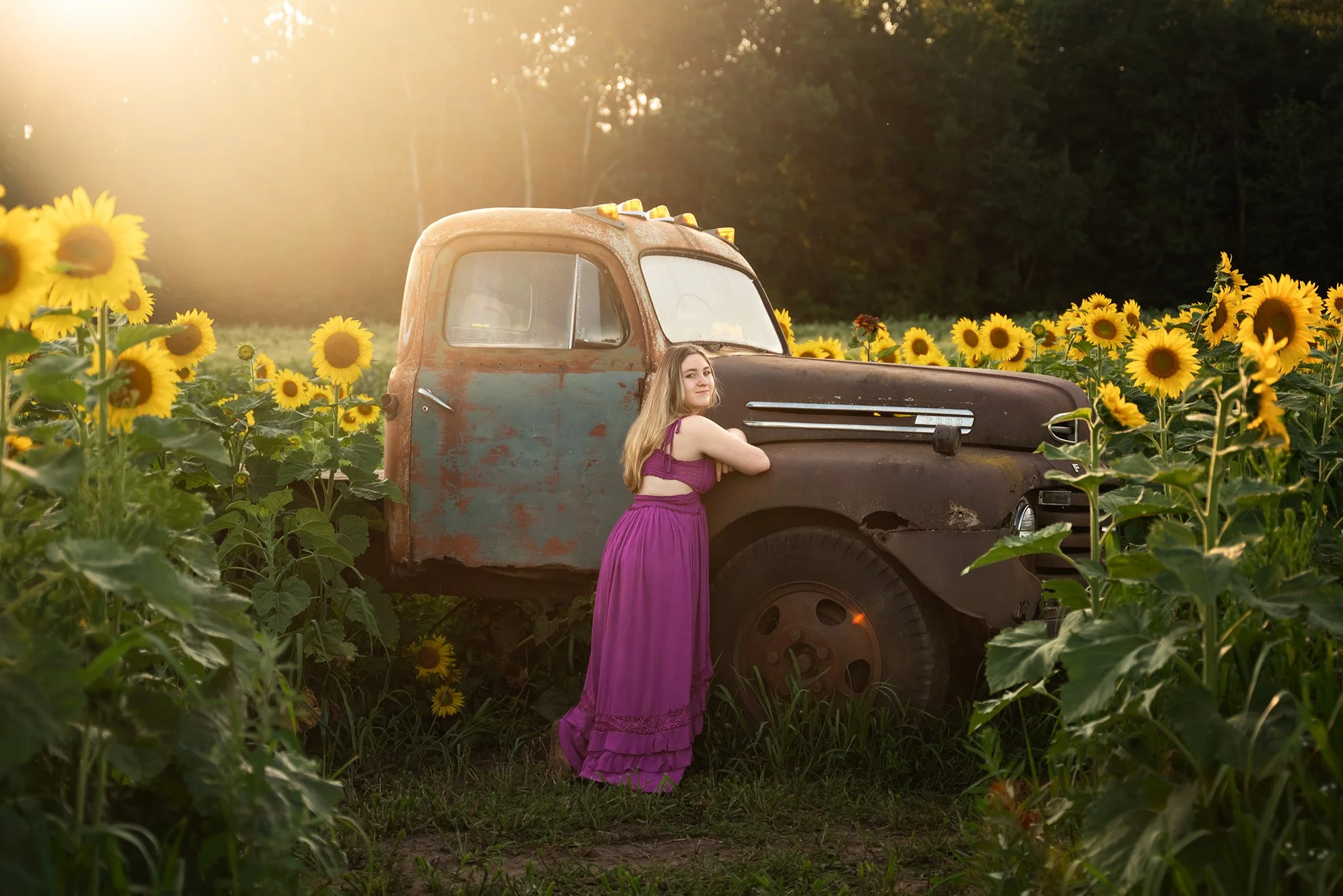
Holly Awwad @hollynicoletimekeeper
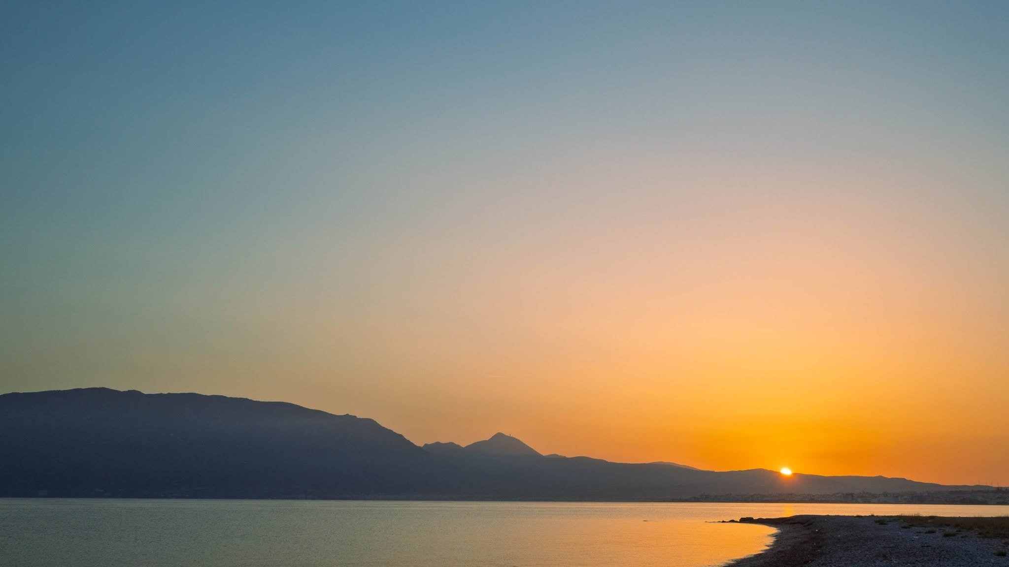
Jan Sylvia Sanders @photos_by_jan
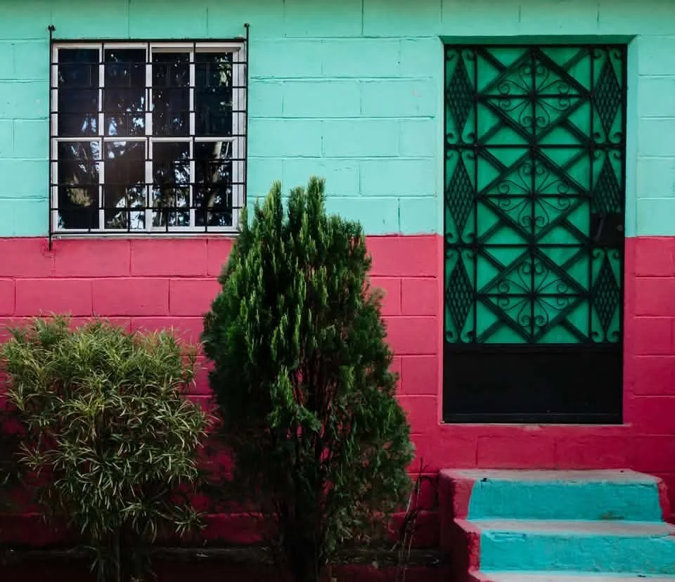
Jeanine Ressler @scratch.focus
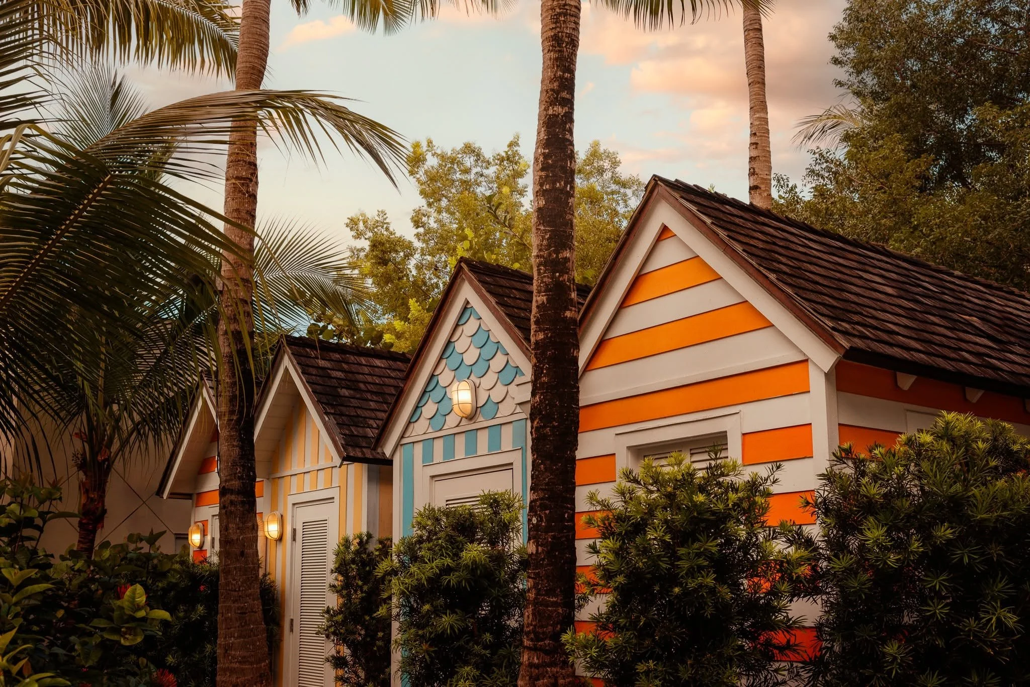
Jennifer Thomas @jennandthen
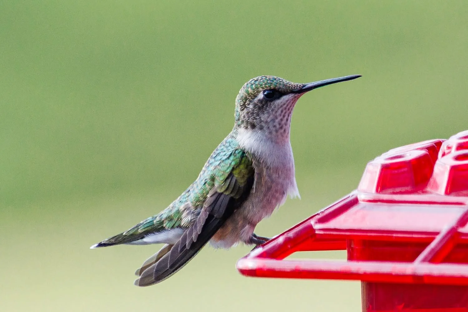
Kim Vanden Bosch @kimjvb
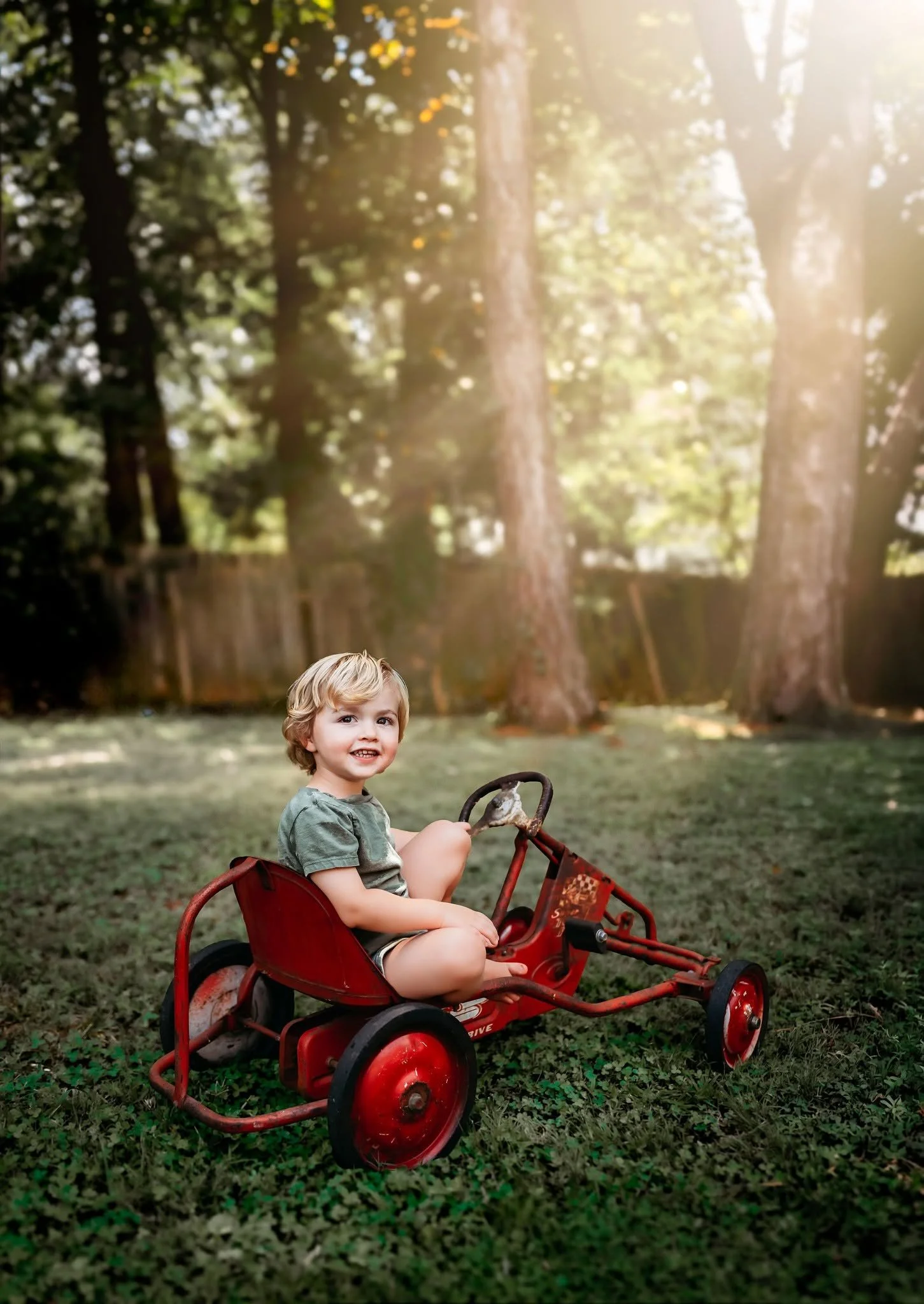
Kristina Markussen @sunsoaked_littles
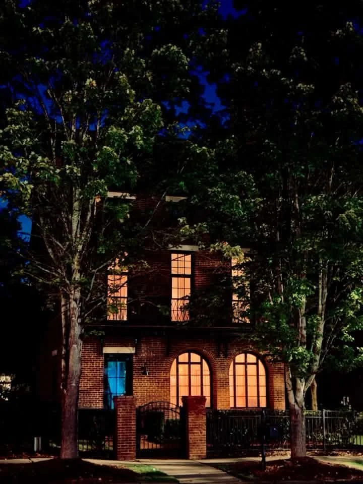
Lola Colberg @luaphotography21
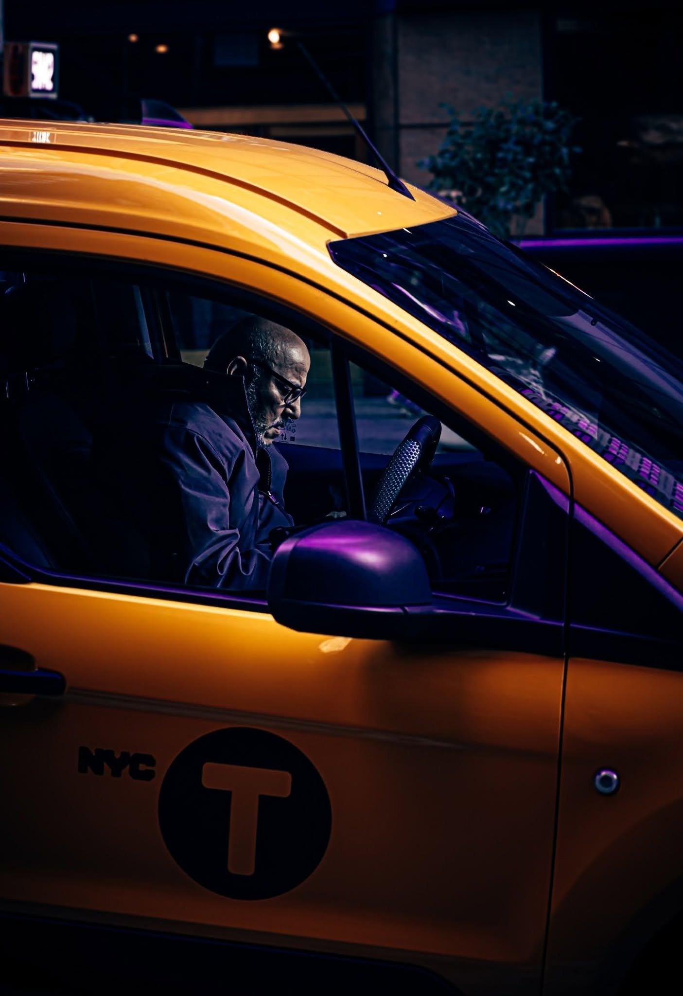
Marshal VanHook @marshal_vanhook

Sarah VanHook @sarah_vanhook
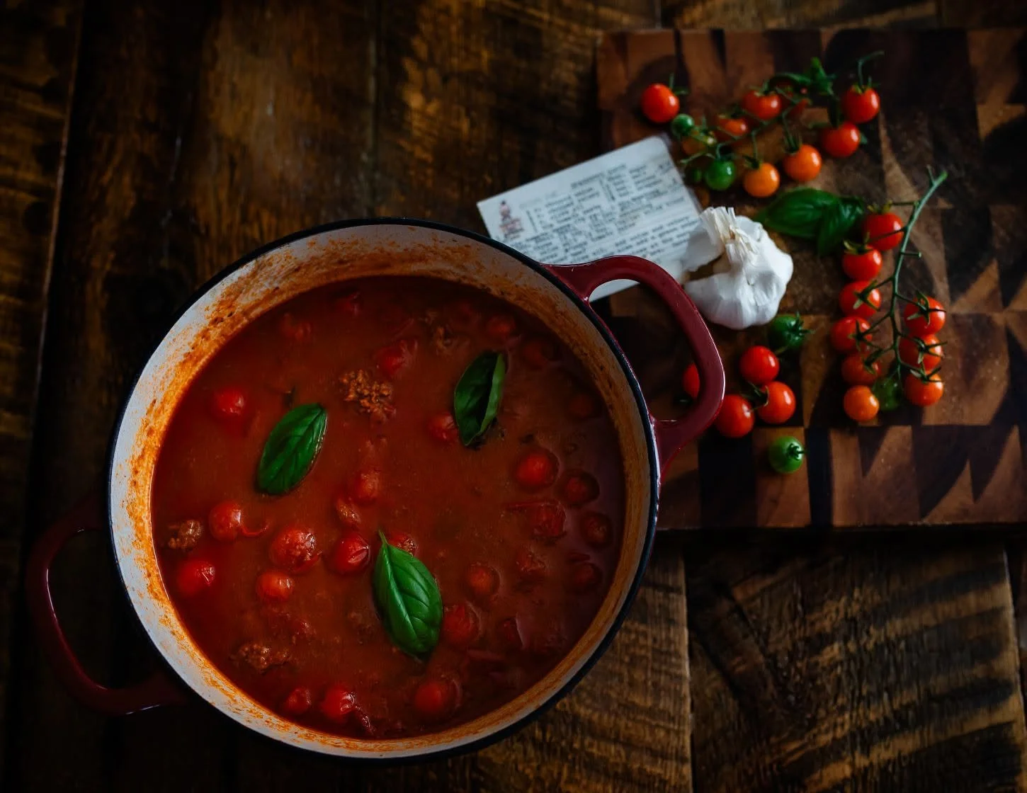
Shannon Denise @shannynanners