How to Get Accurate Skin Tones in Lightroom | by Laura Froese
Few things can make an editor’s eyes cross the same way trying to achieve accurate skin tones can. Are they realistic? Are they too warm, or too cool? Why do they look fine on my monitor but green in my prints? How do I know if the entire gallery is consistent looking? The latter question is especially true if you’re doing things like headshots, shooting across various lighting situations, or a day-long event like a wedding.
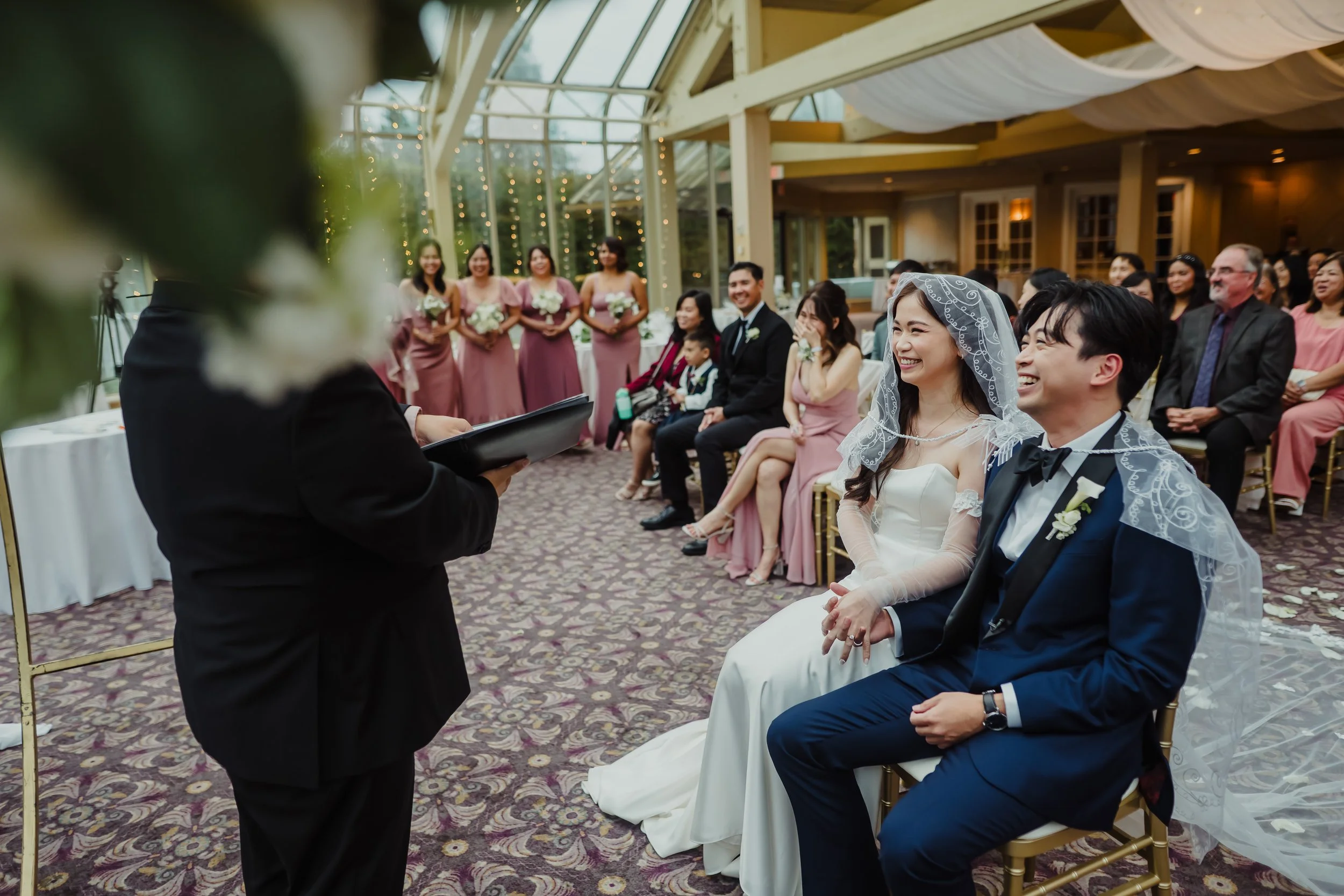
I recently had to upgrade my computer and, as a result, had to purchase a new monitor. The same day this occurred, I did 21 family mini sessions and had to get proofs prepared and uploaded. How would I know what the prints would look like with an unfamiliar monitor and 21 families of all different ethnicities and skin tones? To make it even more challenging, some families were shot in the morning, some at noon, and some at golden hour.
Literally, the only way I could pull this off was by checking my RGB (red-green-blue) numbers. You can do this by using the white balance dropper found in Lightroom Classic (not Lightroom CC - sorry!). Now, I was also simultaneously pulling the images up on different screens and ordering test prints to do my due diligence, but I could be fairly confident in what I was delivering by doing a quick hover over each family’s skin with that dropper.
How to access these numbers:
Open your image in the Develop module.
Enable the histogram in the right-hand panel, and click on the eye dropper tool.
Hover your cursor over the skin tone area you want to evaluate—typically a well-lit portion of the cheek or forehead without obvious colour casts.
These values are represented as three percentages (R, G, B), each ranging from 0 to 100%.
Skin tones can vary significantly by ethnicity and lighting, but most natural-looking skin tones fall into some general RGB ranges. For example:
Light skin:
R: 70–85%
G: 60–75%
B: 50–65%Medium skin:
R: 60–75%
G: 50–65%
B: 40–55%Dark skin:
R: 40–65%
G: 30–55%
B: 25–45%
The key is balance, though. Just having them fall into the right spread isn’t quite enough. You want green to be as close to the middle of the outer two as possible. For example, R-G-B being 80-70-60. You also want to make sure R and G have a 10-20 point spread between each other for lighter skin, but a larger spread is okay for darker skin.
As a general rule, the exposure slider affects the R numbers, and the temperature slider affects the B numbers, with tint controlling the green. There are MANY other ways to tweak your final numbers including masking, HSL, colour curves, etc. However, the MAIN way to control them is through those Basic panel sliders.
While it seems a little daunting at first, I promise it can be life saving (or at the very least sanity saving), and worth a little google research. If you want to do a more in-depth dive, our “Editing Skin Tones Like a Pro” course might be worth a peek as well!


