

Welcome to The Framed Focus Blog!
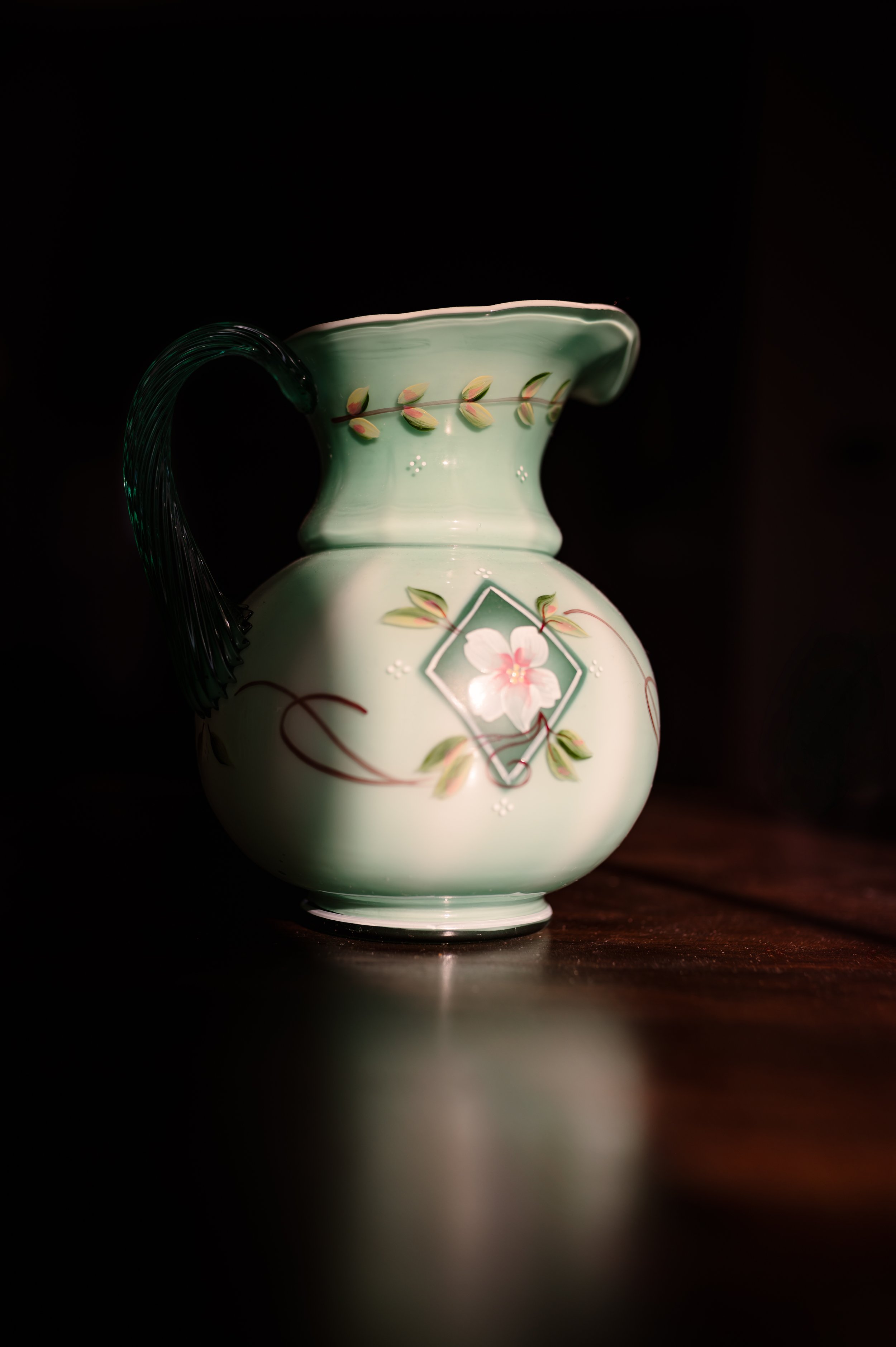
Chase the Rainbow Project | Mint Green
In photography, colour does far more than add visual interest. It shapes the mood of an image, draws the viewer in, and helps communicate the story. In our Chase the Rainbow project, we celebrate colour by focusing on a different shade each month. Whether that’s seeking out the colour in nature, spotting it at home, or styling a scene with thoughtfully selected props and clothing, the project encourages creativity and seeing the world through a more colourful lens.
“It's clear, it's fresh, like a mint candy.” Margaret Atwood
March’s colour is mint green! Mint green is cool-toned shade of green that evokes a sense of freshness and renewal. It’s a calming, uplifting colour that captures the lightness of early spring, symbolising growth, balance, and a fresh start.
Enjoy looking through all our mint green images.
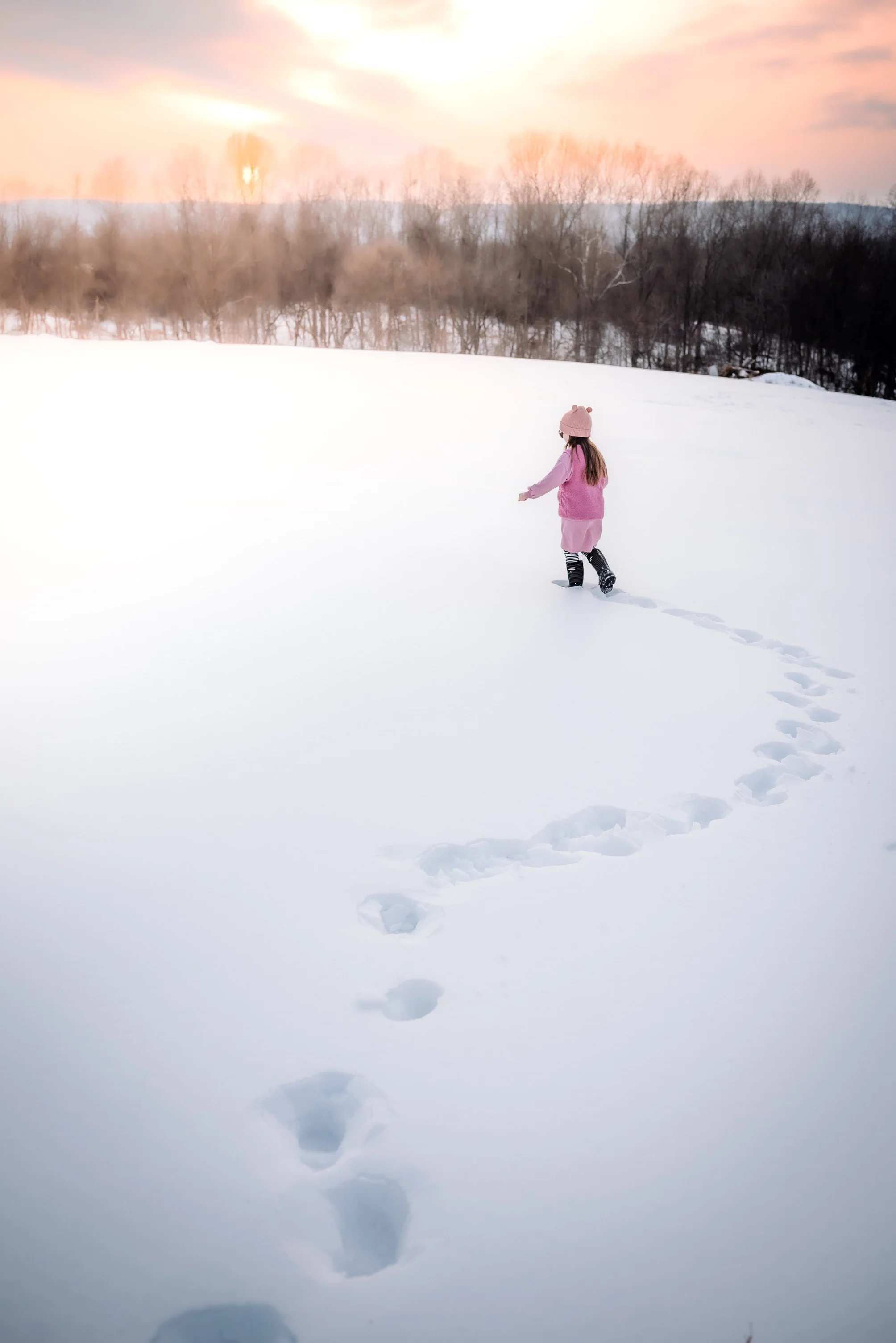
Chase the Rainbow Project | Pink
In photography, colour does far more than add visual interest. It shapes the mood of an image, draws the viewer in, and helps communicate the story. In our Chase the Rainbow project, we celebrate colour by focusing on a different shade each month. Whether that’s seeking out the colour in nature, spotting it at home, or styling a scene with thoughtfully selected props and clothing, the project encourages creativity and seeing the world through a more colourful lens.
“Anything is possible with sunshine and a little pink.” – Lilly Pulitzer
February’s colour is pink! A symbol of nurturing love, femininity, and kindness, pink combines the strength of red with the purity of white. Pink ranges from a soft, innocent baby pink, to an exotic and optimistic coral, to a vibrant, playful magenta, with each shade evoking a different mood.
Enjoy looking through all our pink images.
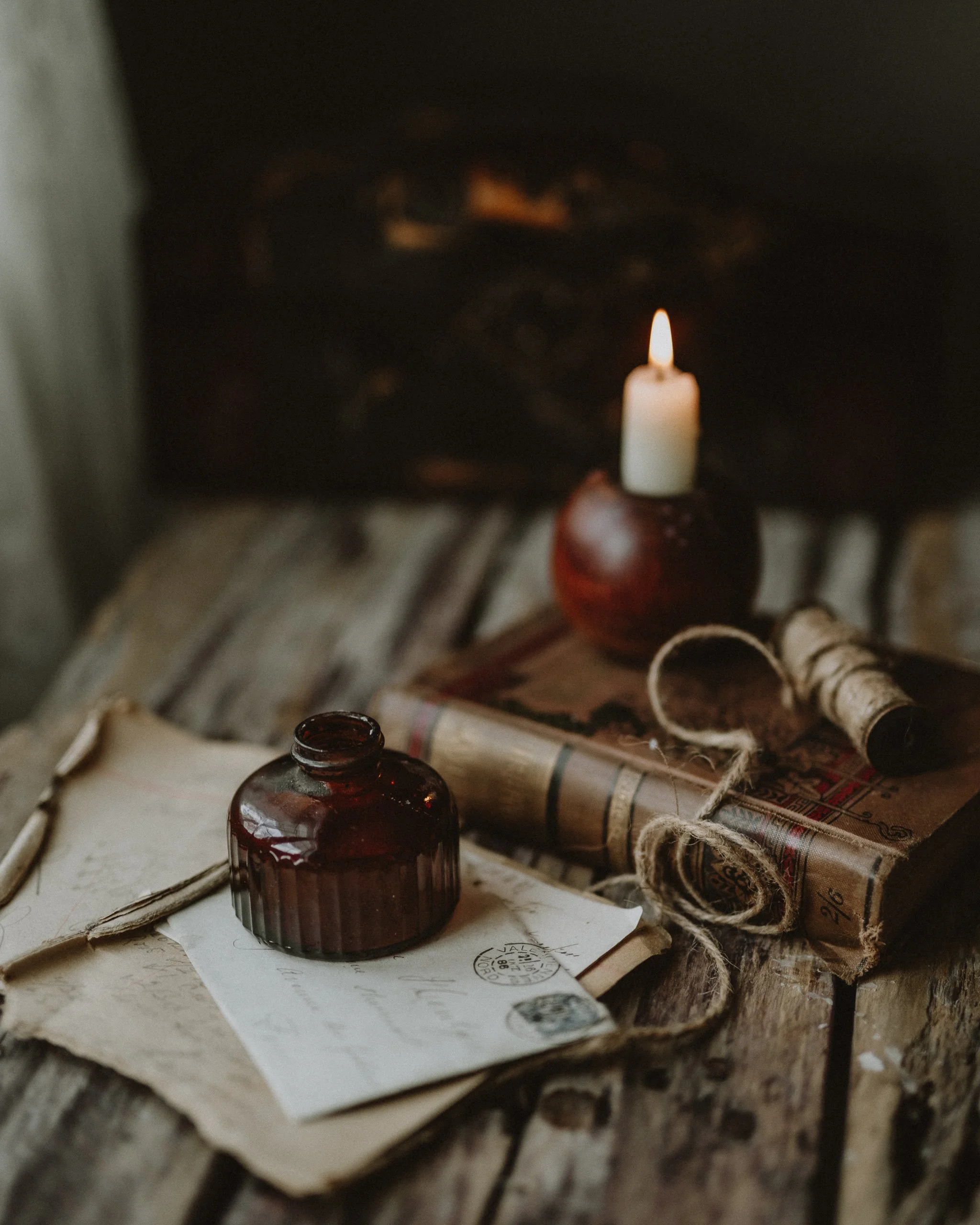
Chase the Rainbow Project | Brown
In photography, colour does far more than add visual interest. It shapes the mood of an image, draws the viewer in, and helps communicate the story. In our Chase the Rainbow project, we celebrate colour by focusing on a different shade each month. Whether that’s seeking out the colour in nature, spotting it at home, or styling a scene with thoughtfully selected props and clothing, the project encourages creativity and seeing the world through a more colourful lens.
“Brown is the color of hearth and home — of dried herbs and stone-ground bread and freshly baked cookies.” Leatrice Eiseman
The first colour for 2026 is brown. Brown is anything but drab! It’s a beautifully warm, earthy colour that creates a feeling of coziness and nostalgia. Coffee, chocolate, crispy dried leaves, tree bark, stuffed toys, pets, architecture, we see so much of brown in our everyday lives that we can easily overlook its magic.
Enjoy looking through all our brown images.

Chase the Rainbow Project | Silver & Gold
Colour is one of the most powerful tools in photography. Colour can evoke emotions, tell stories, and transform an ordinary scene into something extraordinary. In our Chase the Rainbow project we explore the beauty of a different colour each month. Whether that’s finding the colour in nature, around the house or setting up a scene with colourful props and clothing.
“Silver, gold - I don't discriminate! I like sparkly things.” - Charlaine Harris
This month’s theme was Gold / Silver. These shiny, metallic colours evoke a sense of luxury and glamour. Each carries its own distinct mood: gold is often associated with warmth, success and celebration, while the cooler silver suggests reflection, clarity and quiet sophistication. Together, they feel especially fitting for this Christmassy time of year, bringing a touch of sparkle and seasonal magic to every image.
Enjoy looking through all our images.

Chase the Rainbow Project | Rainbow
Colour is one of the most powerful tools in photography. Colour can evoke emotions, tell stories, and transform an ordinary scene into something extraordinary. In our Chase the Rainbow project we explore the beauty of a different colour each month. Whether that’s finding the colour in nature, around the house or setting up a scene with colourful props and clothing.
“When it rains look for rainbows, when it’s dark look for stars.” -Oscar Wilde
This month’s theme was Rainbow. Although not strictly “a colour”, we include “rainbow” every year because it’s such a beautiful spectrum of all the colours! It’s a symbol of hope, promise and new beginnings, peace and unity, and a reminder that even after the storm, light and colour can shine through.
Enjoy looking through all our rainbow images.
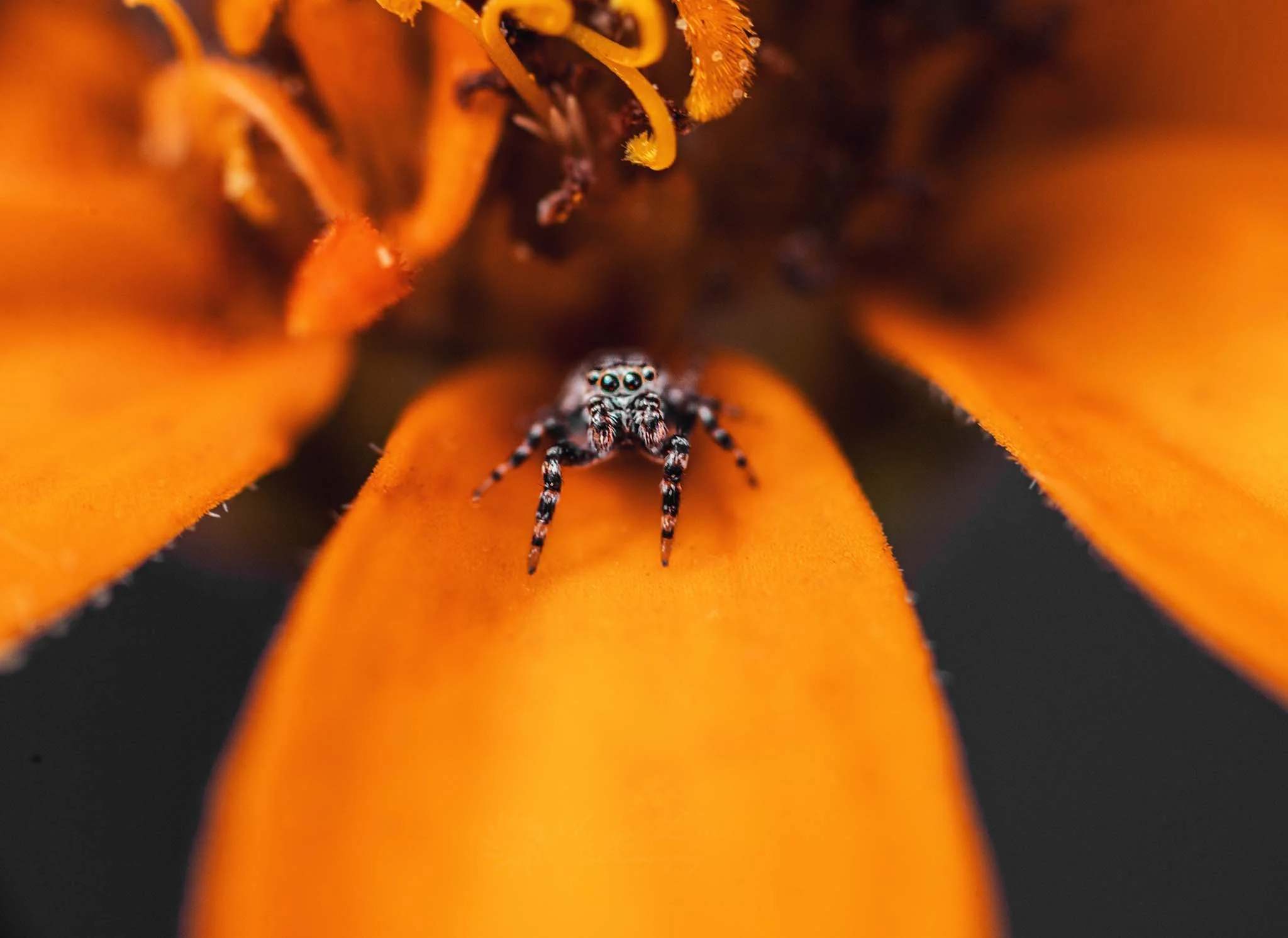
Chase the Rainbow Project | Orange
Colour is one of the most powerful tools in photography. Colour can evoke emotions, tell stories, and transform an ordinary scene into something extraordinary. In our Chase the Rainbow project we explore the beauty of a different colour each month. Whether that’s finding the colour in nature, around the house or setting up a scene with colourful props and clothing.
“The sky takes on shades of orange during sunrise and sunset, the colour that gives you hope that the sun will set only to rise again.” - Ram Charan
This month our colour was orange. Orange is optimistic, playful and exotic. A blazing sunset, a crackling campfire, a comforting bowl of pumpkin soup; virtually everything associated with orange signifies warmth and elicits positive emotions.
Enjoy looking through all the different images we have created with orange.

52 Weeks | Week 39 | Monochromatic Colors
52 Clicks | Week 39 | Monochromatic
Our Project 52 finished up color month with the monochromatic color scheme. Although this is often a term used for black and white photography, it's actually defined as using different shades, tints, and tones of a single color. Monochromatic images create a cohesive, harmonious look that emphasizes mood and texture. See how the p52 participants used this color scheme so very brilliantly.
xo,
Angie Mahlke

52 Weeks | Week 38 | Analogous Colors
52 Clicks | Week 38 | Analogous
Our Project 52 moved onto the analogous color scheme in our month of color. If you're unfamiliar with this term, it refers to the colors touching on the color wheel, like blues and greens or yellows and oranges. These color combinations are oftentime harmonious, and they evoke specific emotions based on whether they're warm or cool in temperature.
The p52 participants used this color scheme thoughtfully, and I am yet again in awe of their creativity.
xo,
Angie Mahlke

52 Weeks | Week 37 | Complementary Colors
52 Weeks | Week 37 | Complementary Colors
Our Project 52 moved onto complementary colors, which are the two colors across from each other on the color wheel. Blue + orange. Purple + yellow. Green + red. The p52 participants either set out to find these colors that occur naturally in nature or they were more creative in their approach to photographing the color combos.
Do you have a combination that you're naturally drawn to?
xo,
Angie Mahlke

Chase the Rainbow Project | Cyan
Colour is one of the most powerful tools in photography. Colour can evoke emotions, tell stories, and transform an ordinary scene into something extraordinary. In our Chase the Rainbow project we explore the beauty of a different colour each month. Whether that’s finding the colour in nature, around the house or setting up a scene with colourful props and clothing.
"You make different colors by combining those colors that already exist” - Herbie Hancock
This month our colour was cyan. Cyan falls between green and blue in the rainbow colours, and includes loads of different shades such as turquoise, teal, petrol, aquamarine, peacock and so on. It’s a tranquil and fresh colour, making us think of tropical waters and sunny skies.
Enjoy looking through all the different images we have created with cyan.

52 Weeks | Week 36 | Cool Colors
52 Clicks | Week 36 | Cool Colors
Cool colors convey a sense of calm, tranquility, and sometimes melancholy. Our Project 52 participants were tasked with using cool colors (blues, greens, purples) last week, and I think you’ll agree that they definitely understood the assignment.
What is your favorite way to use cool colors in your work? Or do you gravitate toward warmer colors?
xo,
Angie Mahlke

52 Weeks | Week 35 | Warm Colors
52 Clicks | Week 35 | Warm Colors
The whole month of September in our Project 52 is about exploring colors in our work. Just like any choice in photography, our use of color can be a powerful tool. Every color has an emotional connotation that can determine the intention of the image. Learning how to use colors to your advantage can make a huge difference in your work.
Last week we focused on warm colors, which are reds, oranges and yellows. These colors convey feelings of warmth, energy, and comfort. Look at how the p52 participants used warm colors and try to determine what their intentions were with their color choices.
xo,
Angie Mahlke

Chase the Rainbow Project | Soft Pink
Colour is one of the most powerful tools in photography. Colour can evoke emotions, tell stories, and transform an ordinary scene into something extraordinary. In our Chase the Rainbow project we explore the beauty of a different colour each month. Whether that’s finding the colour in nature, around the house or setting up a scene with colourful props and clothing.
“Let the soft blush of pink color remind us to be gentle with ourselves and others.” - Unknown
This month our colour was soft pink. Soft pink is a light, pastel shade of pink that symbolises innocence, tenderness and sweetness.
Enjoy looking through all the different images we have created with soft pink.
Chase the Rainbow Project | Yellow
Colour is one of the most powerful tools in photography. Colour can evoke emotions, tell stories, and transform an ordinary scene into something extraordinary. In our Chase the Rainbow project we explore the beauty of a different colour each month. Whether that’s finding the colour in nature, around the house or setting up a scene with colourful props and clothing.
"Yellow is the color which is closest to light. We associate the rays of the sun and the stars with it. It is the radiance of the spirit." - Ueli Seiler-Hugova
This month our colour was yellow. Yellow is such a bright and happy colour. It’s the colour of the sunshine, daffodils, sunflowers and bees. It makes us feel energised, positive and hopeful.
Enjoy looking through all the different images we have created with yellow!

Chase the Rainbow Project | Lilac
Colour is one of the most powerful tools in photography. Colour can evoke emotions, tell stories, and transform an ordinary scene into something extraordinary. In our Chase the Rainbow project we explore the beauty of a different colour each month. Whether that’s finding the colour in nature, around the house or setting up a scene with colourful props and clothing.
“In the world of colors, lilac is a gentle whisper” - Unknown
This month our colour was lilac. Lilac is a soft, pale shade of purple that feels feminine, youthful and elegant. It’s a soothing colour that creates a sense of balance and serenity. Enjoy looking through all the different images we have created with lilac!

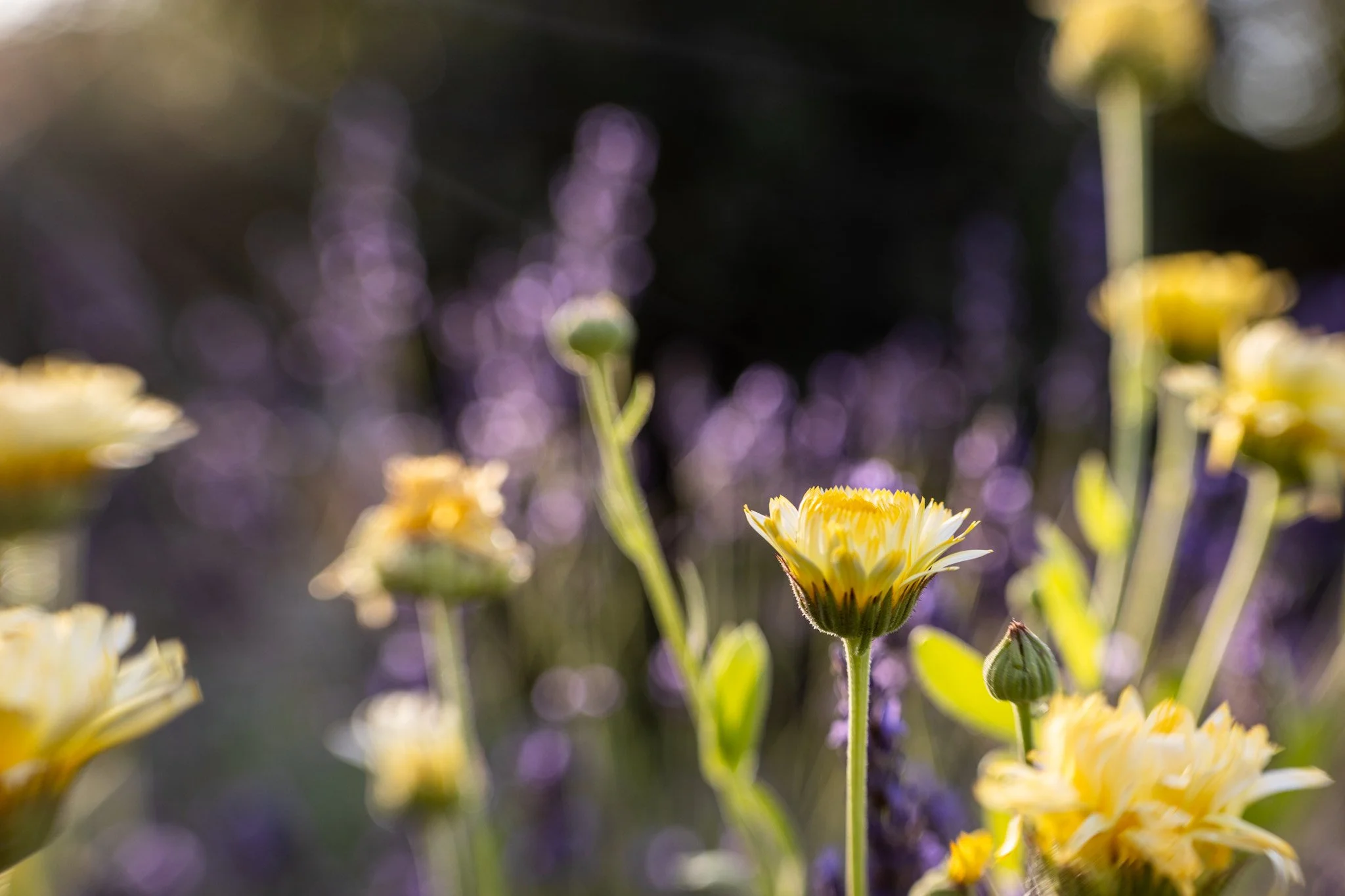
Chase the Rainbow Project | Green
"Green is the color of nature’s hope, ever blooming, ever eternal." — Ralph Waldo Emerson
This month our colour was green. Green is a fresh, calm and harmonious colour, the colour of life and growth. There are more shades of green than any other colour. Enjoy looking through all the different images we have created with green!

Chase the Rainbow Project | Red
“Red has always been my color, because red stands out.” - Ravyn Lenae
This month our colour was red. Red is strong and powerful, warm and passionate, confident and rebellious. It's a colour of extremes, symbolic of both good and bad. Enjoy looking through all the different images we have created with red!

Using Colour with Intention | by Abi Coop
Colour is one of the fundamental ingredients for creating a strong, compelling image. It plays a huge role in visual storytelling; drawing the eye to the subject as well defining the setting and mood. In this blog, I share 5 ways of enhancing your work by using colour with intention.

Chase the Rainbow Project | Purple
Colour is one of the most powerful tools in photography. Colour can evoke emotions, tell stories, and transform an ordinary scene into something extraordinary. In our Chase the Rainbow project we explore the beauty of a different colour each month. Whether that’s finding the colour in nature, around the house or setting up a scene with colourful props and clothing.
“Artists use purple to speak to the soul, a color that transcends words.” – Frida Kahlo
This month our colour was purple. A majestic colour associated with royalty and luxury, as well as a sense of mystery, magic and spirituality. Enjoy looking through all the different images we have created with purple!

Chase the Rainbow Project | Magenta
Colour is one of the most powerful tools in photography. Colour can evoke emotions, tell stories, and transform an ordinary scene into something extraordinary. In our Chase the Rainbow project we explore the beauty of a different colour each month. Whether that’s finding the colour in nature, around the house or setting up a scene with colourful props and clothing.
“I’m having a magenta day. Not just red, but magenta!” - Stephen King
This month our colour was magenta; a vibrant shade of pink. Magenta is a fun, inspiring and uplifting colour. Many of us found this colour a real challenge to find, so enjoy looking through all the different images we have created with magenta!
On the blog
*
On the blog *

Get Free Resources!
Sign up for our mailing list to stay in-the-know about our latest free resources, available courses and blog posts!