52 Clicks | Week 36 | Analogous Colors
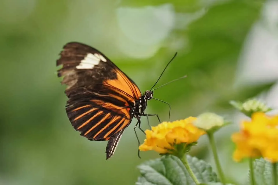
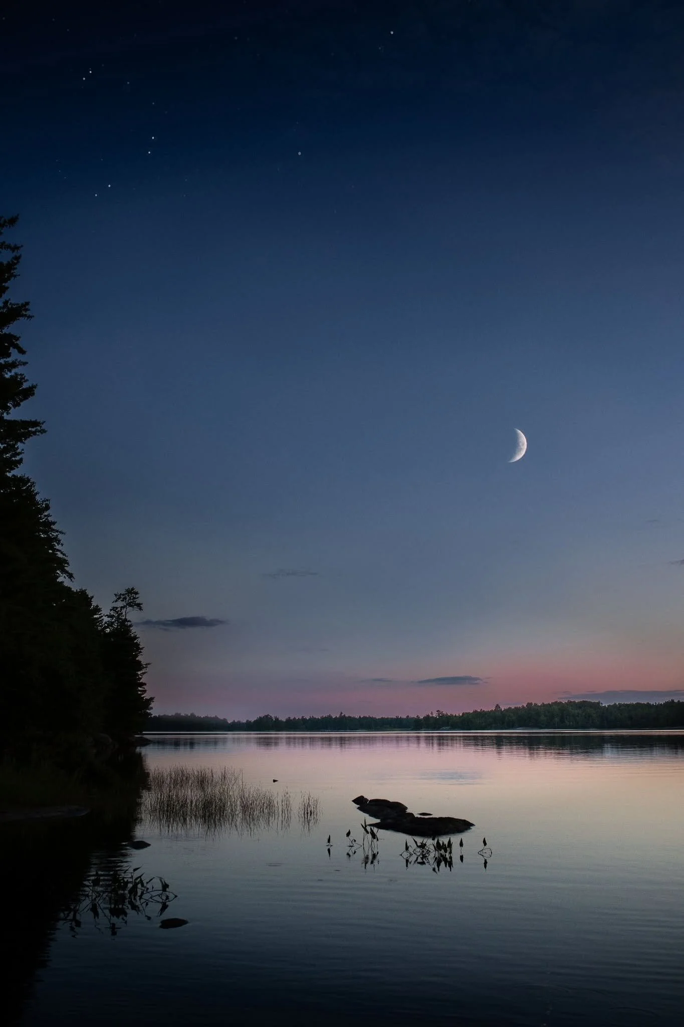
Using color psychology in your photography is great way to create emotionally impactful images. Knowing the emotional meanings of specific colors is important when using them intentionally. The analogous color scheme creates a sense of calmness with its lack of contrast. This is from using three or more colors that sit next to each other on the color wheel. Using warm or cool colors determines the emotional impact (warm = energy / cool = tranquility).
Do you gravitate toward the complementary or analogous color scheme in your work?
As always, the open invitation to join our group remains. We'd love to have you.
Angie Mahlke
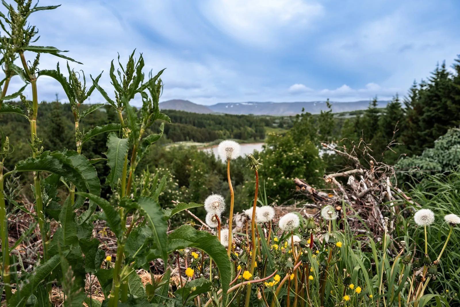
Anna Guðnadóttir @agiceland

Casey Ladisa @chaoticblissphotos
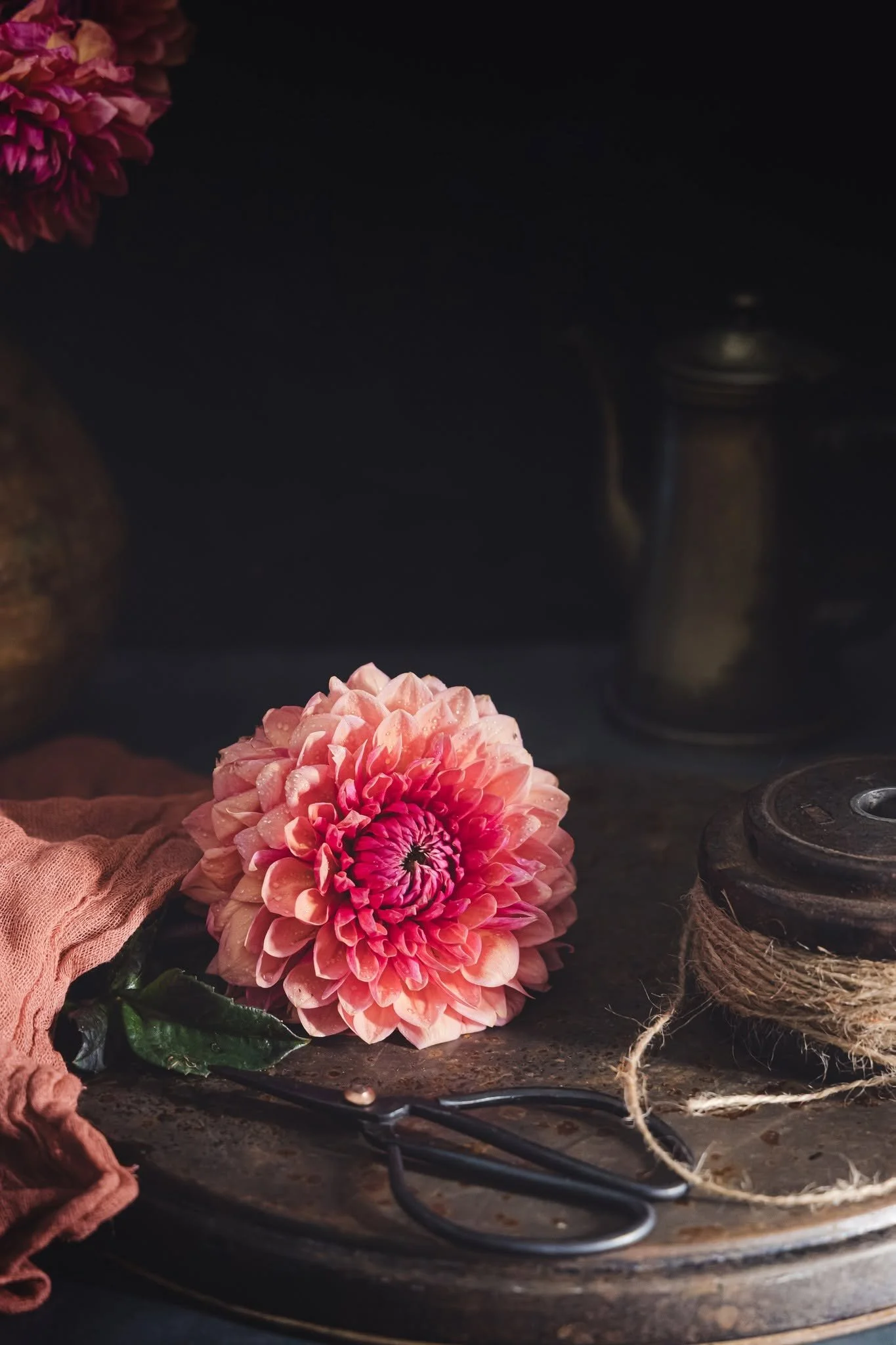
Christina Kaplan @christinamariephotographyri

Diana Johnson @dianaljohnsonphotography
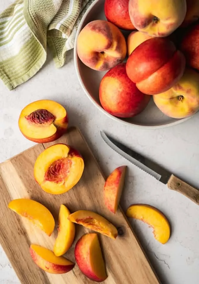
Dorene Hookey @dorenehookey
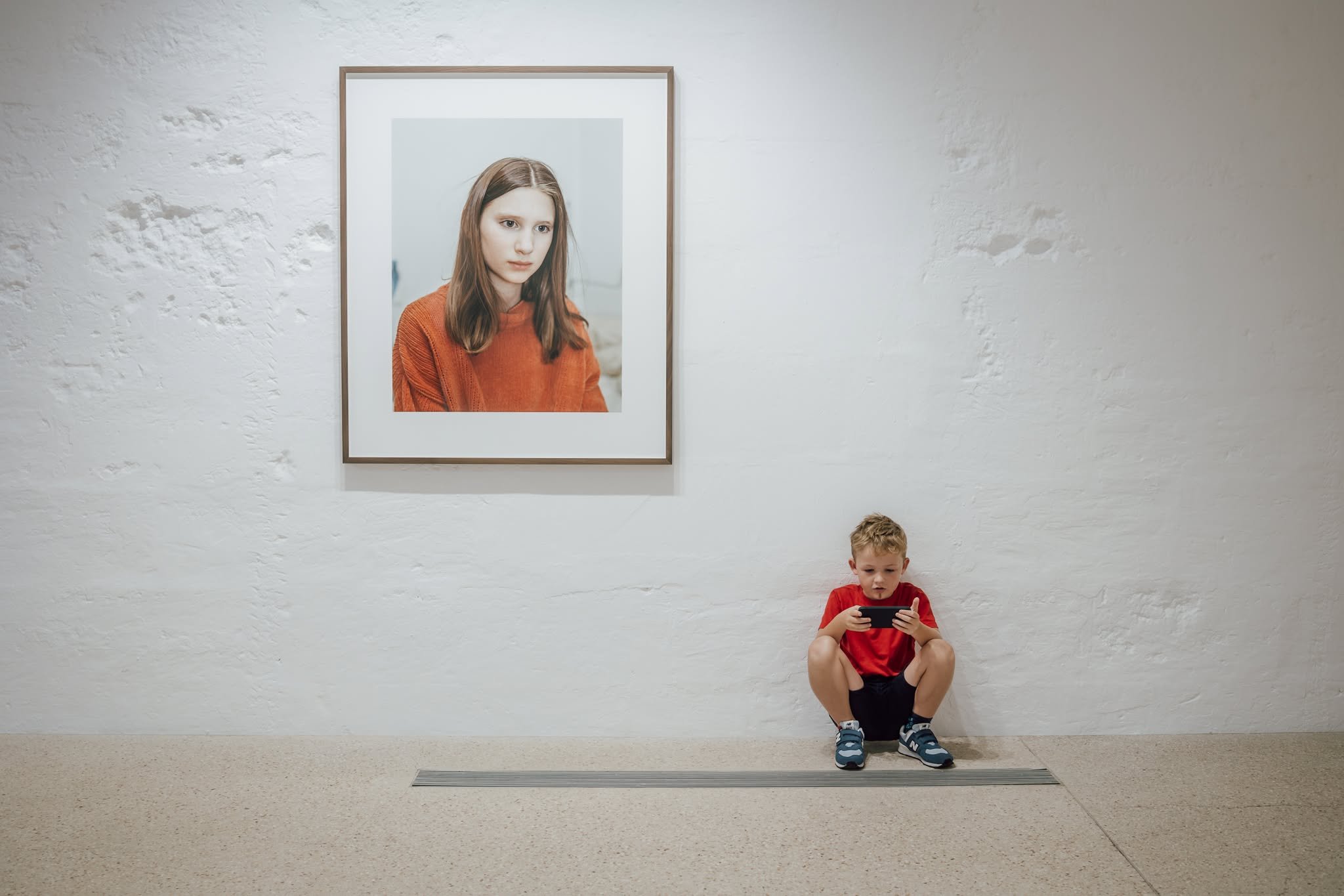
Emma Challinor @emmachallinorphotography
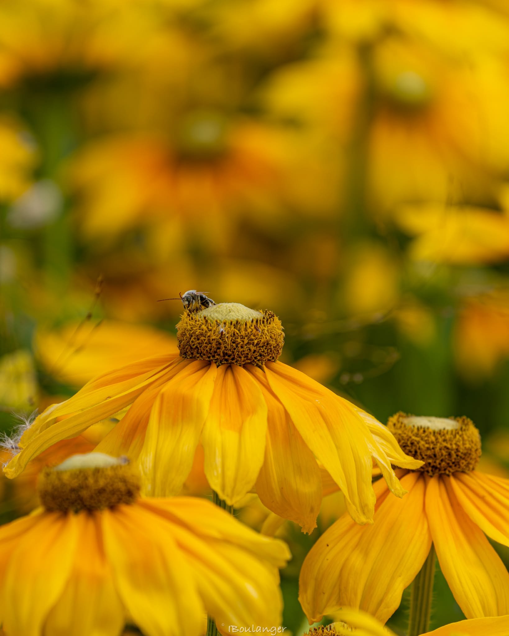
Isabelle Boulanger @ibou247
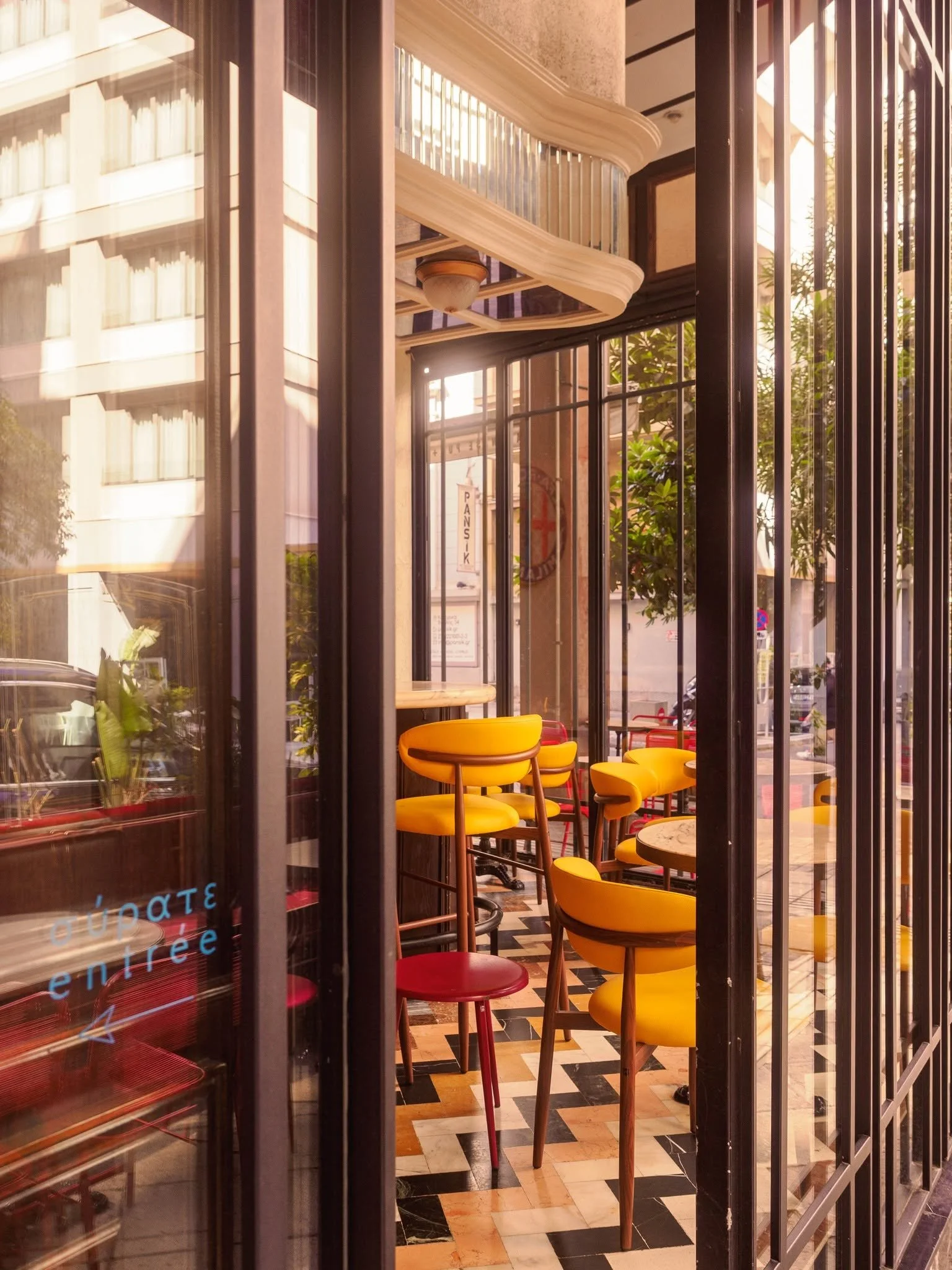
Jan Sylvia Sanders @photos_by_jan

Jeanine Ressler @scratch.focus

Jennifer Thomas @jennandthen

Kim Vanden Bosch @kimjvb

Kristina Markussen @sunsoaked_littles
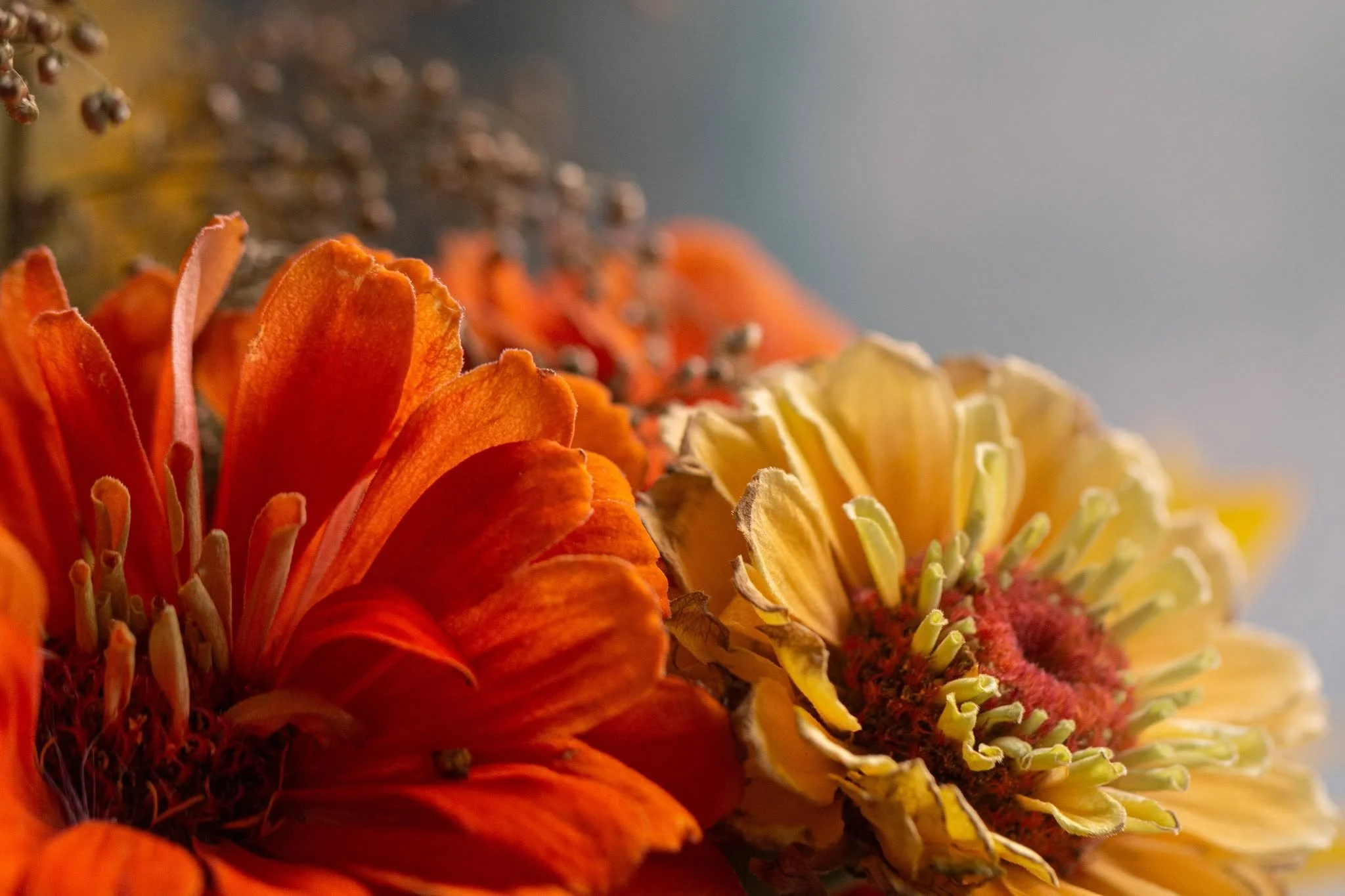
Kristina Mazur @photographybykristinaelizabeth
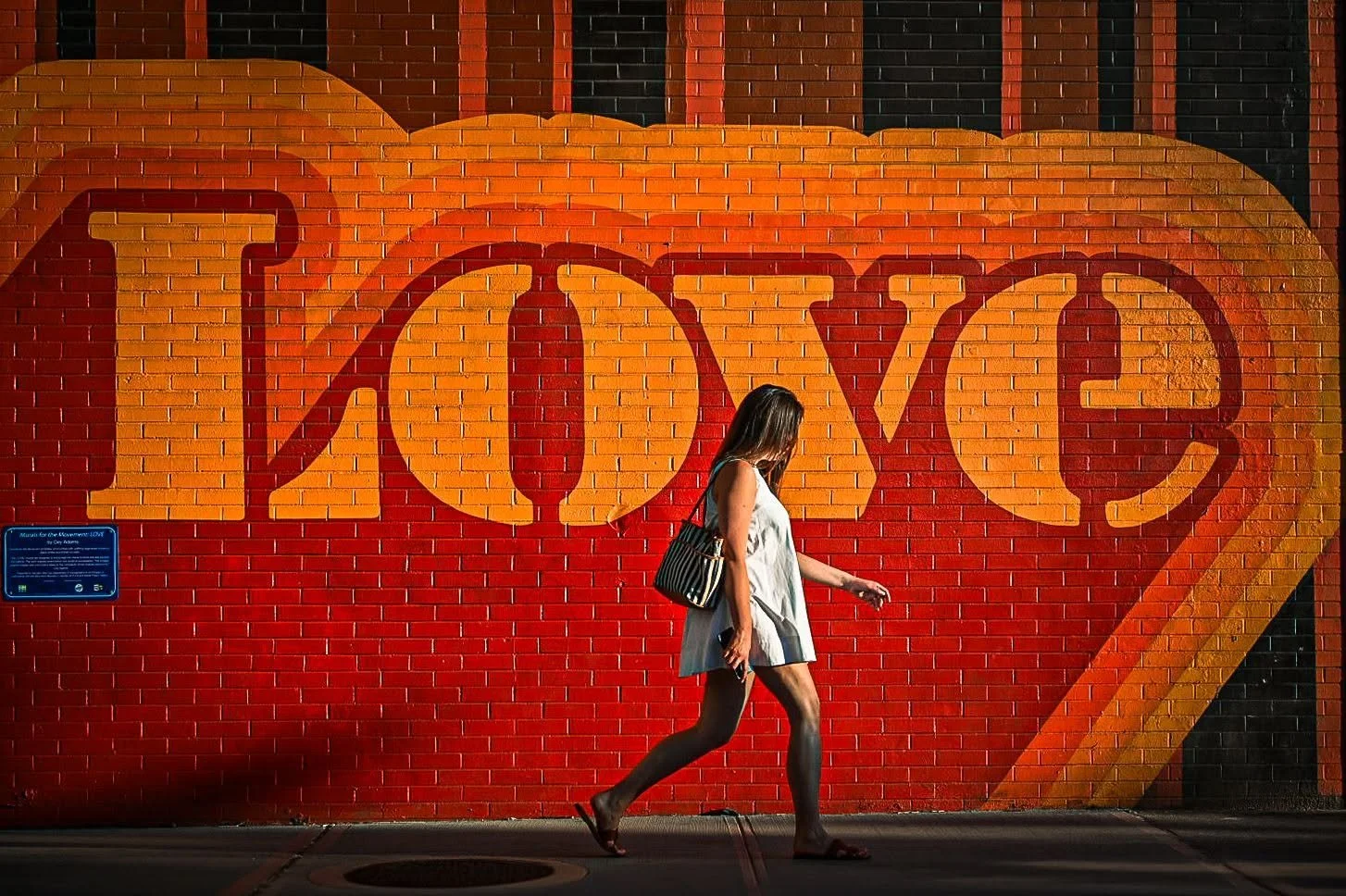
Marshal VanHook @marshal_vanhook

Meg Lynes @margaretlynesphotography
Rachel Hudson Field @rshf_photography
Shannon Denise @shannynanners